Donut
Donut charts are showing proportions within a whole, making it easy to compare parts at a glance.
Our donut chart offers multiple direct label options, supports Top N with aggregation for all other items, and includes small multiples so you can display several donuts side by side for easier comparison.
Gallery
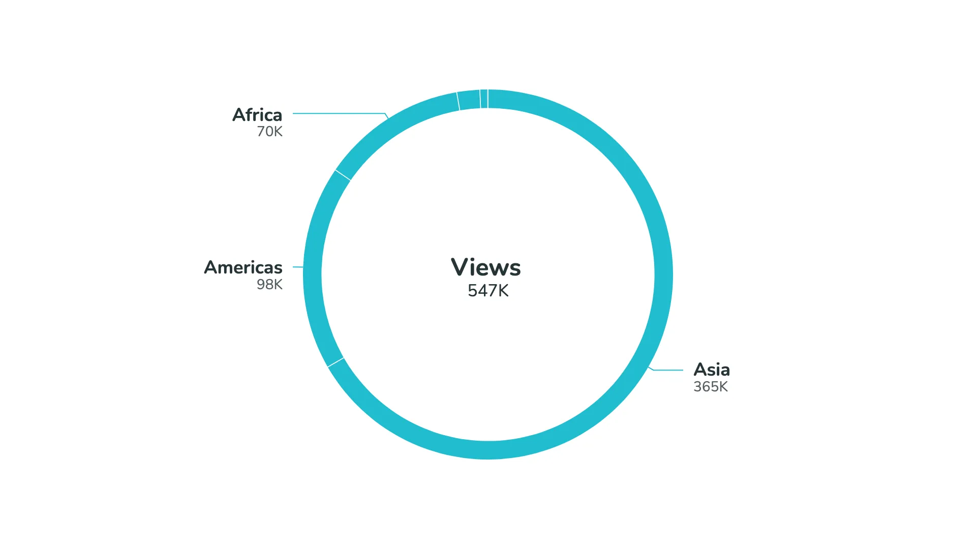
Default view of the donut chart
Marketplace
Visit the Microsoft Marketplace to download this Power BI custom visual
and discover related reporting examples and report themes.
KEY FEATURES
 Donut or pie chart
- Multiple options for label placement
- Flexible slice design
- Small multiples
- Top N + Others
- Conditional color formatting
- Flexible card design
- Filters & tooltips