Stacked area
Stacked area charts are ideal for visualizing proportions over time, showing how parts contribute to the whole and how that changes across a timeline.
Our stacked area chart automatically places labels inside the areas — no manual adjustments needed. It also includes several stack types (wiggle, diverging, or 100% stacked) and supports small multiples, letting you create multiple charts side by side for easier comparison.
Gallery
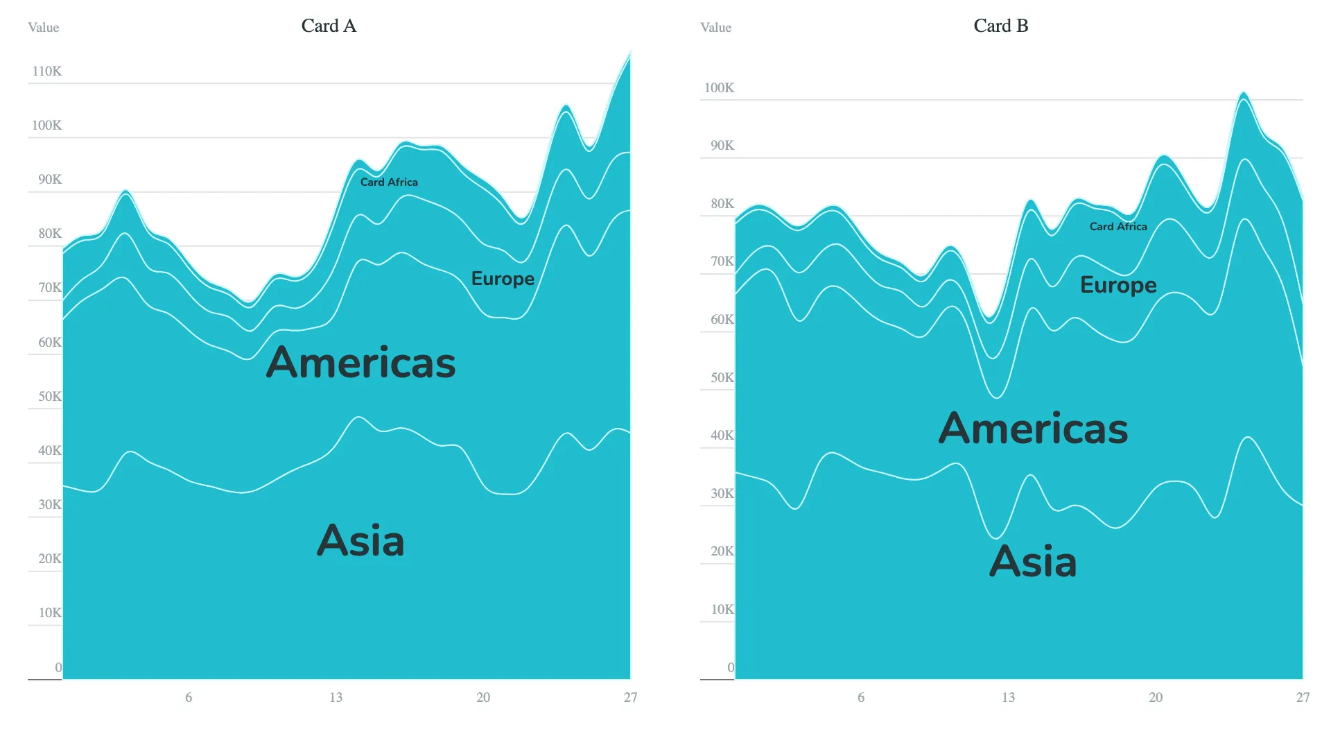
Default view with automatic label placement
Marketplace
Visit the Microsoft Marketplace to download this Power BI custom visual
and discover related reporting examples and report themes.
Report example
Download a report example for the Stacked area visual feature highlights.
KEY FEATURES
 Multiple stack and order types
- Small multiples
- Top N + Others
- Conditional color formatting
- Automatic label placement
- Modern axis
- Flexible card design
- Filters & tooltips