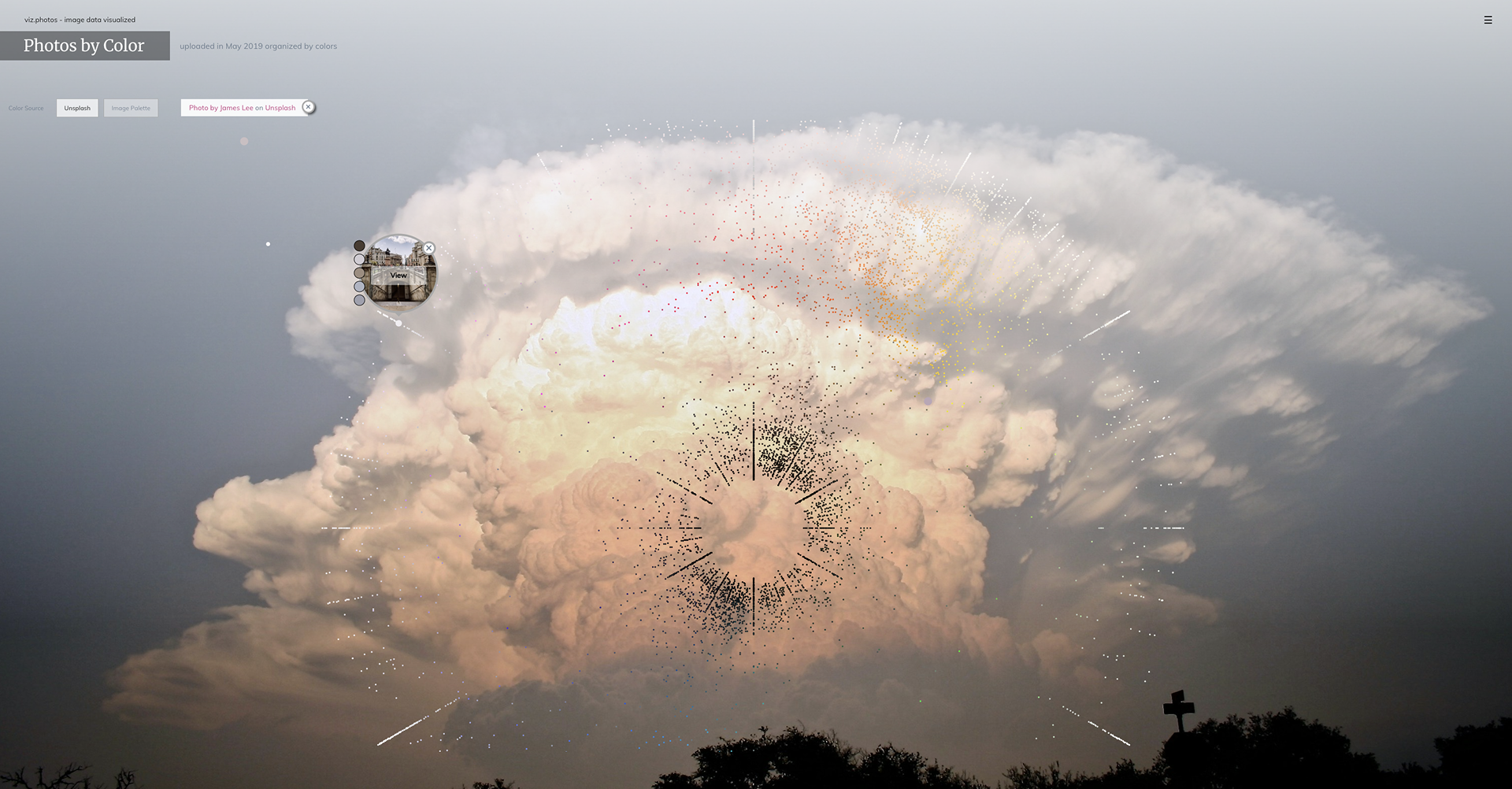
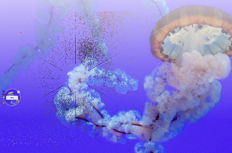
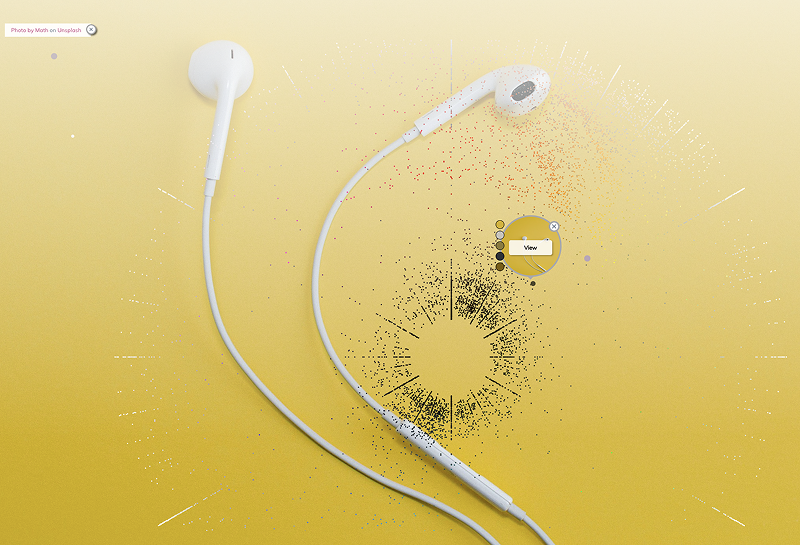
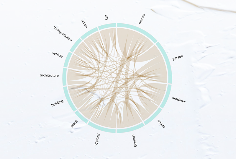
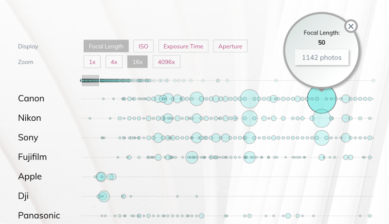
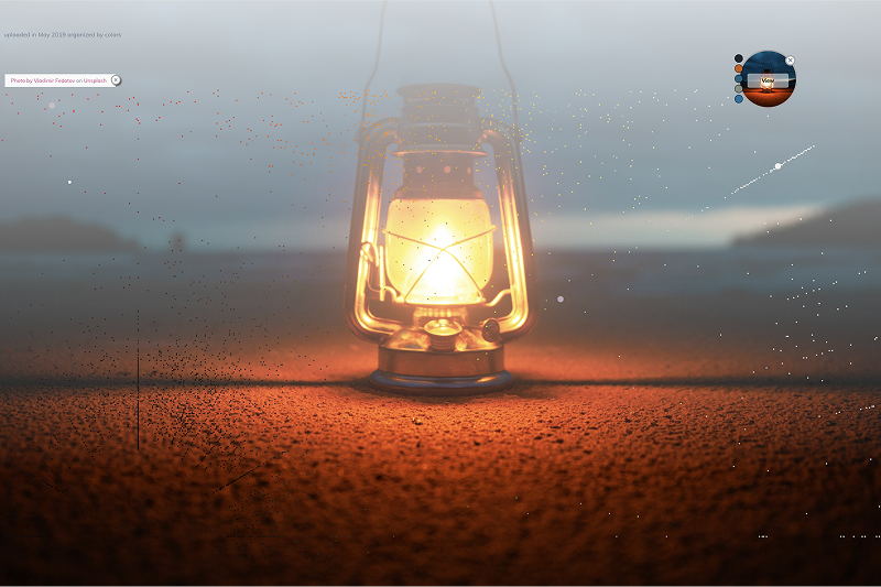
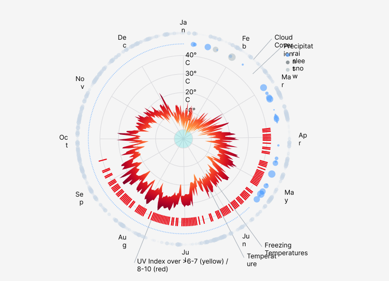
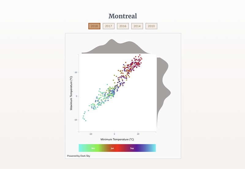
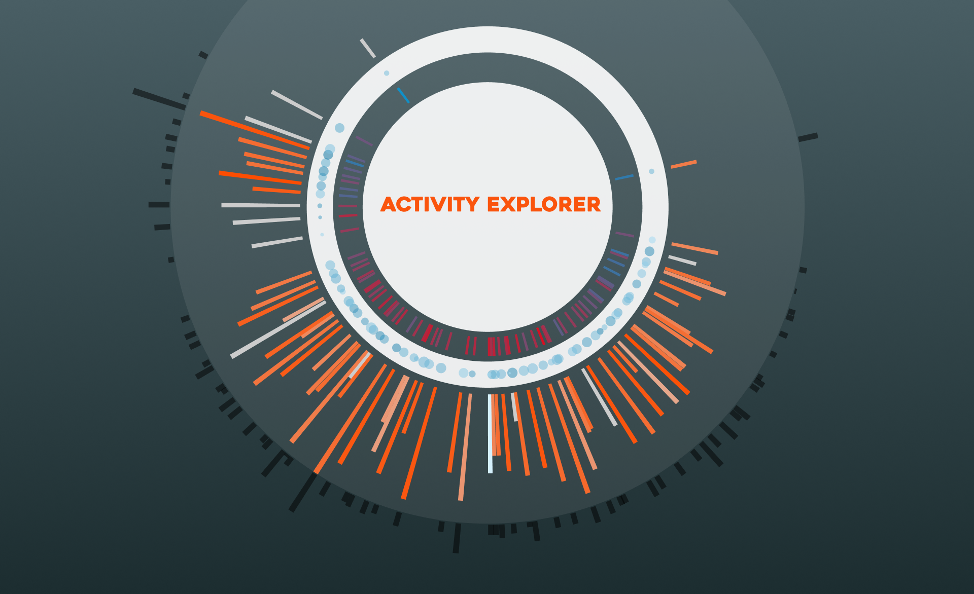
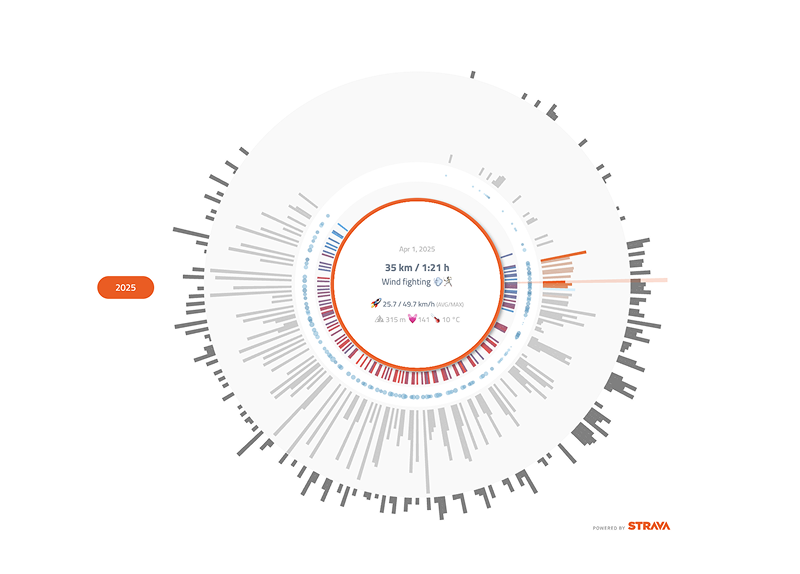
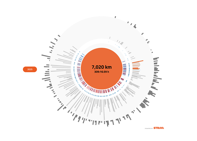
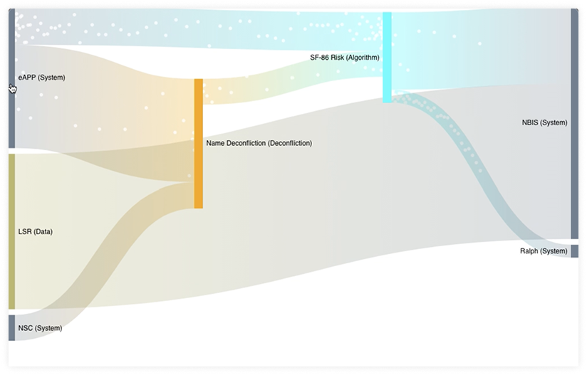
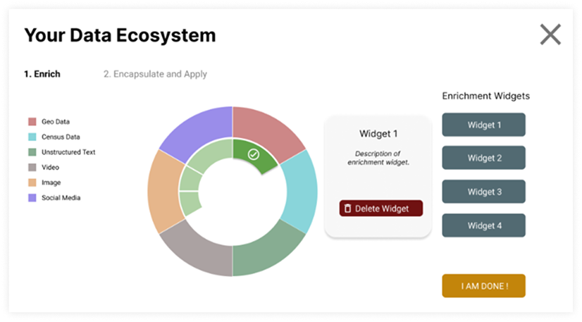
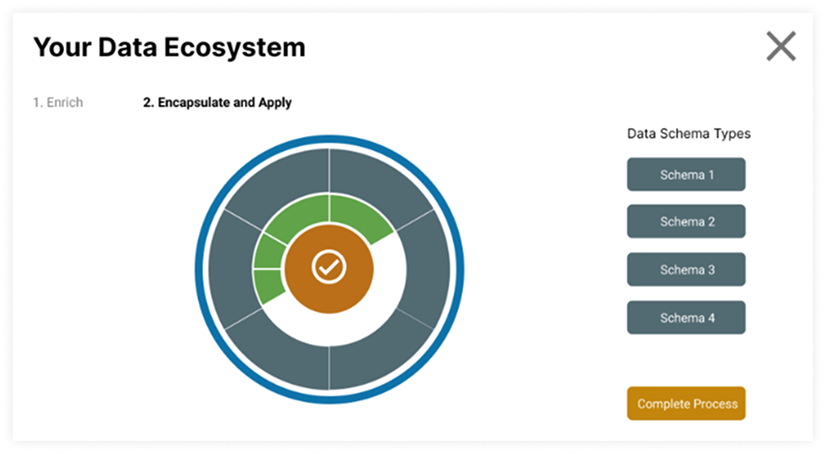
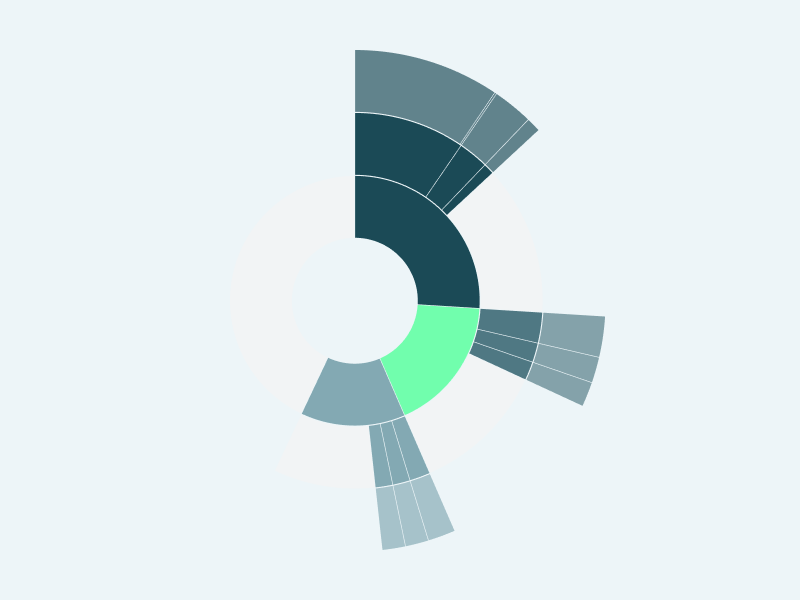
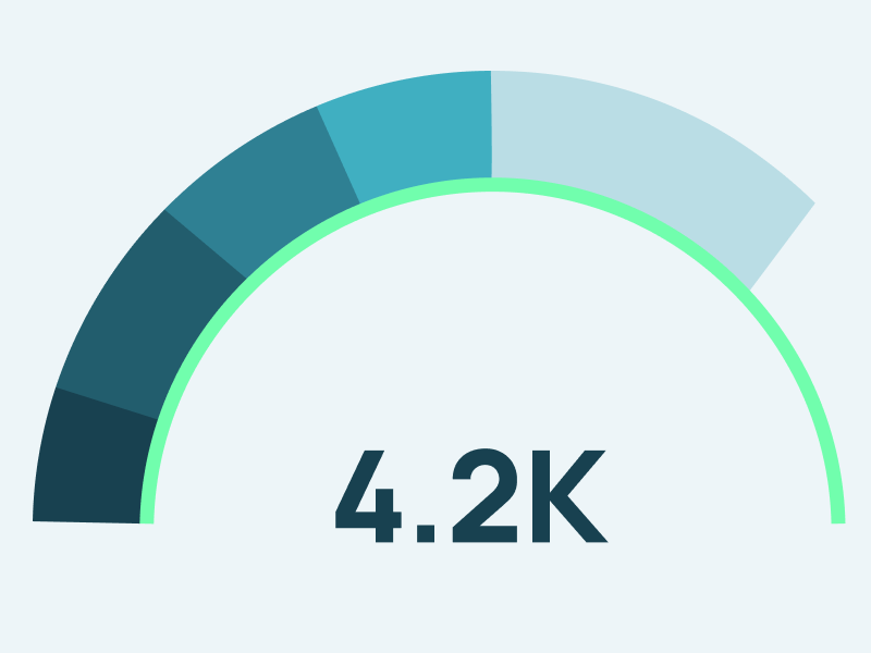
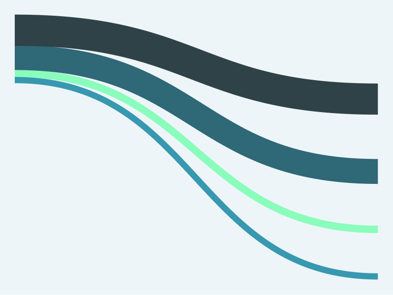
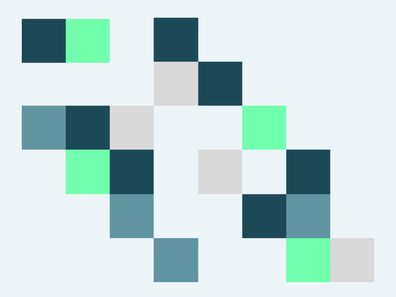
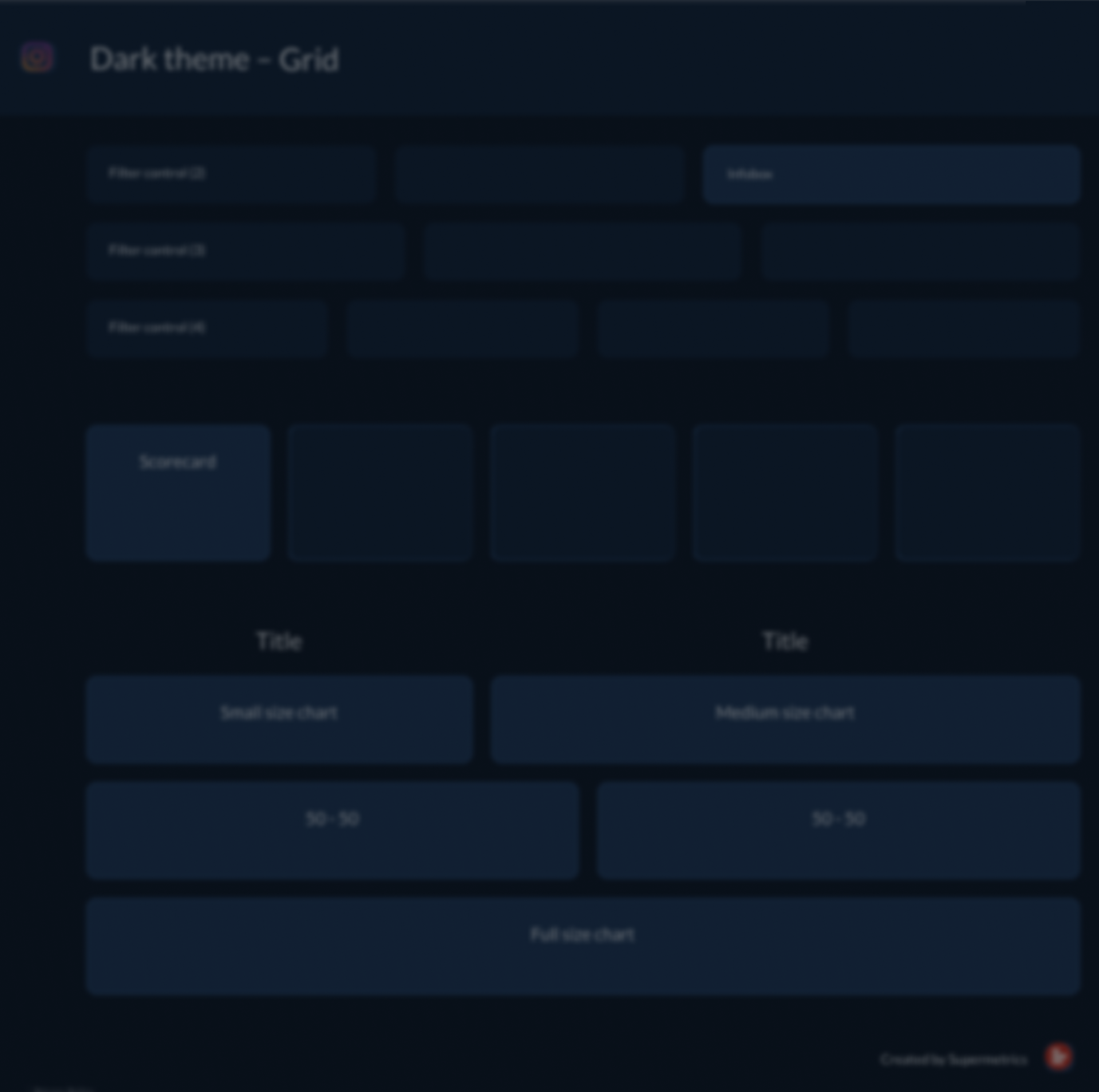
What they share: every one is built from a dataset and generated entirely through code. No illustration tools, no manual adjustments, no post-production. When the data changes, the visual updates — no tweaking layouts, adjusting labels, or fixing alignment.

That's the difference between design and process. Code-driven visuals don't just look right once. They stay right.

Strategy Data

Web-based dashboards

Some corporate dashboards need a level of graphical control that standard BI tools cannot provide. Web-based dashboards fill that gap.

This strategic dashboard was built using Observable Framework and Plot, a JavaScript-based visualization platform. r42 also builds with Svelte and other modern web frameworks to match your existing tech stack.

Strategic dashboard detail view
Dashboard metrics overview
Dashboard visualization components

Color

Color analysis of Unsplash uploads

An experimental project visualizing around 10,000 photo uploads to Unsplash, a photo-sharing website, during May 2019.

All photos were classified by color scheme, technical specifications, and keywords.

Color classification overview
Color spectrum analysis
Photo color distribution
Color keyword mapping
Color scheme detail

Weather

Dense data encoding

Data visualization can encode large amounts of data in a small space. The human brain reads patterns faster than raw numbers.

A reader will quickly see that Tokyo's summers are hot and most rain falls in spring.

Weather data visualization — Tokyo 2018
Weather patterns detail

Activities

Activity Explorer for Looker Studio

This project brings Strava activity data into Looker Studio and visualizes a full year of activities in a single chart.

Both the Looker Studio connector and the community visualization are available free of charge. The circular visual captures multiple metrics per activity: distance, elevation gain, average speed, heart rate, and temperature, creating a unique drawing for every athlete and every year.

Activity explorer — full year circular visualization
Activity explorer — detail metrics

Sound

12 Lignes — Portrait de Claude Chaussard

This single-page website features a recording of a modern classical piece performed by the NEM (Nouvel Ensemble de Montreal) in honor of artist Claude Chaussard.

The visualization is an interpretation of the music that runs in real time as the piece plays.

Sound visualization — real-time music interpretation
Sound visualization — waveform detail
Sound visualization — full composition view

Chaos and Order

3D data animation

An experimental 3D animation that visualizes a large dataset as seemingly chaotic, unstructured motion, then transitions into an interactive interface where the user walks through a process of categorizing the data step by step.

3D data animation — chaotic state
3D data animation — transition phase
3D data animation — categorization interface
3D data animation — structured view
3D data animation — final organized state

Looker Studio

Community Visualizations

Over 20 community visualizations developed for Supermetrics between 2019 and 2024. These were among the first third-party visuals for Looker Studio and are available as free visuals or as part of selected Supermetrics packages.

Looker Studio community visualization
Looker Studio chart types
Looker Studio visualization detail
Looker Studio report example

Style Guides

Data report guides for Looker Studio

Looker Studio offers limited formatting options out of the box. Without clear guidelines, reports across an organization quickly drift apart in style, color use, and layout.

A data report style guide defines the rules: which colors to use, how charts are laid out, how labels and axes are formatted, and what each report type should look like.

These guides give data teams a shared reference so every report follows the same visual language. They reduce back-and-forth during review, speed up report creation, and make sure the output looks consistent no matter who builds it.

Data report style guide overview
Style guide color and layout rules
Style guide chart formatting
Style guide report templates

Download portfolio

Download the complete r42 portfolio as a PDF and share it with colleagues and partners. Our portfolio is available in three languages.

A portfolio looks back into the past.
Let's look ahead instead.

What insights do you need to reveal for your audience?

Let's find out together.

Get in touch