Treemaps visualize parts of a whole using surface area rather than linear space, allowing them to show many more segments than donut charts or stacked bars. The polygon treemap takes this approach further by replacing standard rectangles with irregular, organic-looking polygons.
This visualization works particularly well when differences between segments are significant. It can break down metric values by up to two dimensions, and the unusual form makes it effective at drawing attention in dashboards and reports.
Shapes that catch attention
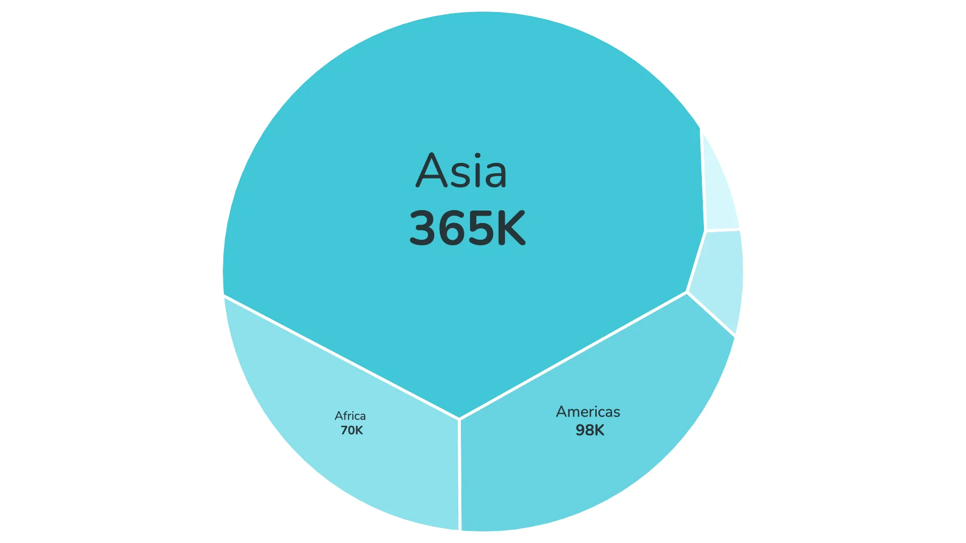
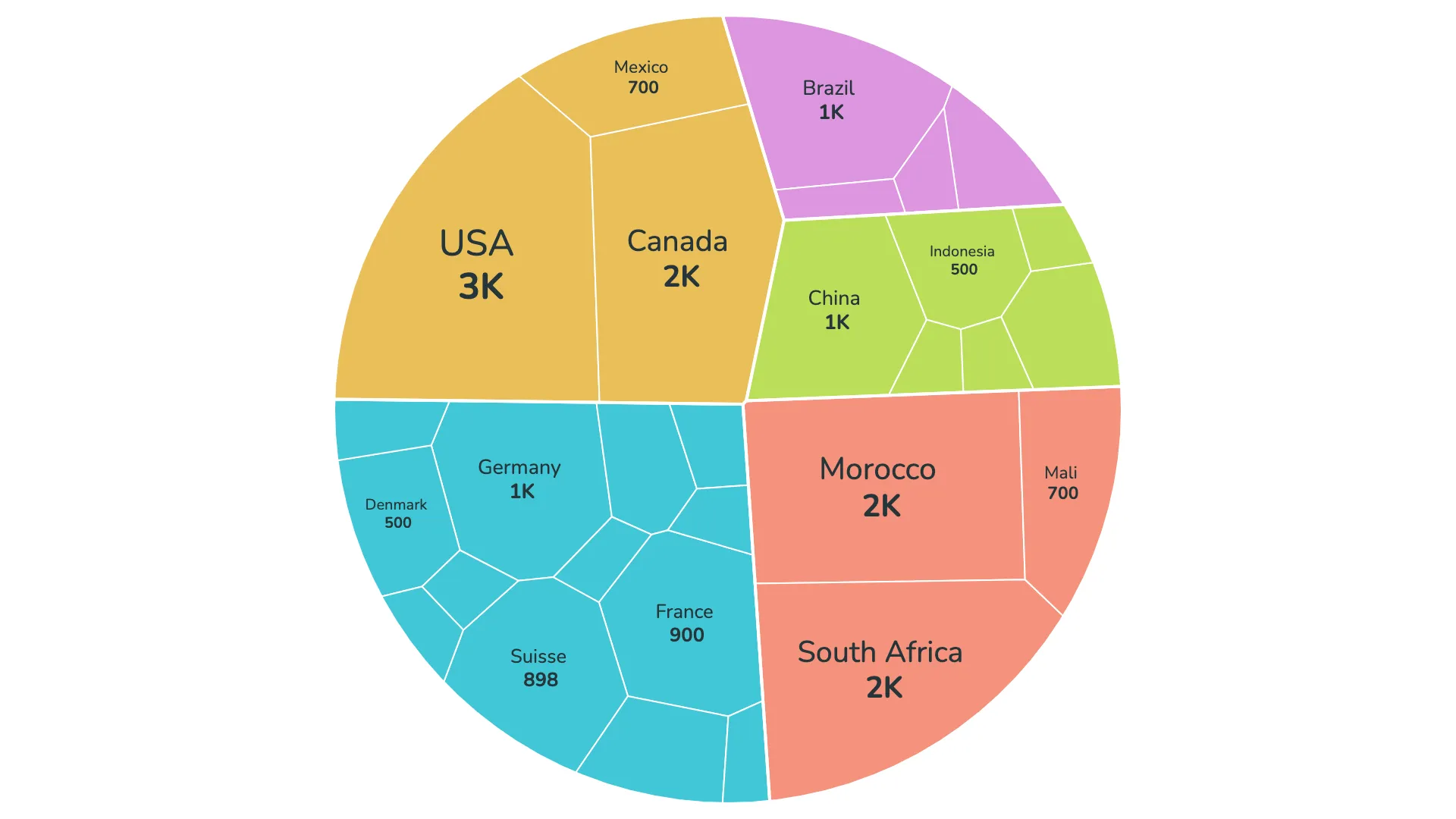
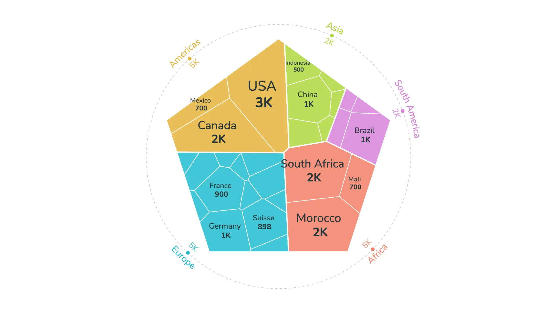
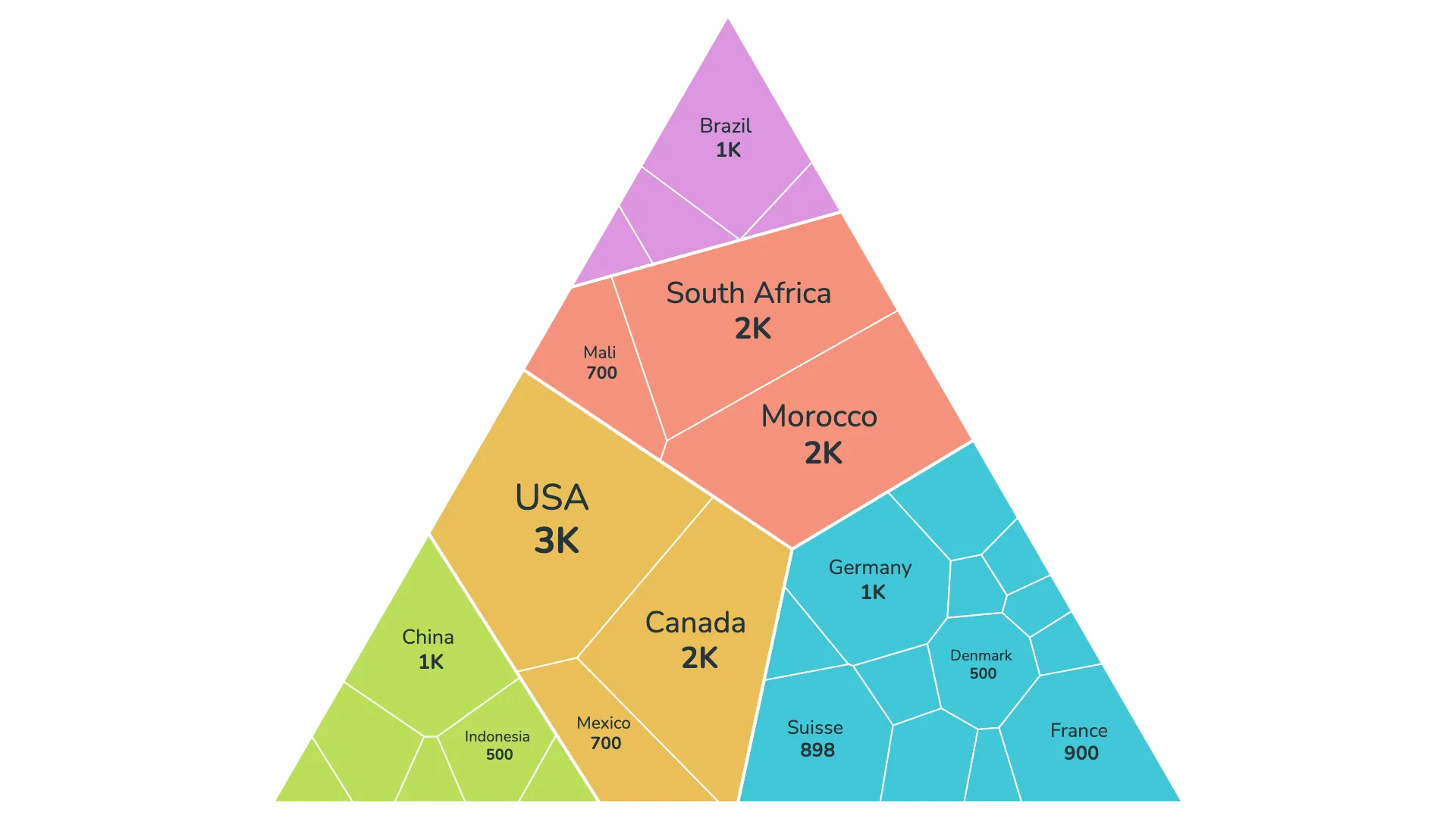
The polygon treemap offers six different container shapes: circle, square, triangle, pentagon, hexagon, and diamond. Within each shape, the data is divided into irregular polygons using a technique called Voronoi tessellation.
This creates a natural, organic appearance that stands out from typical chart types. The flowing boundaries between segments give the visual a distinctive character while still representing the data accurately.
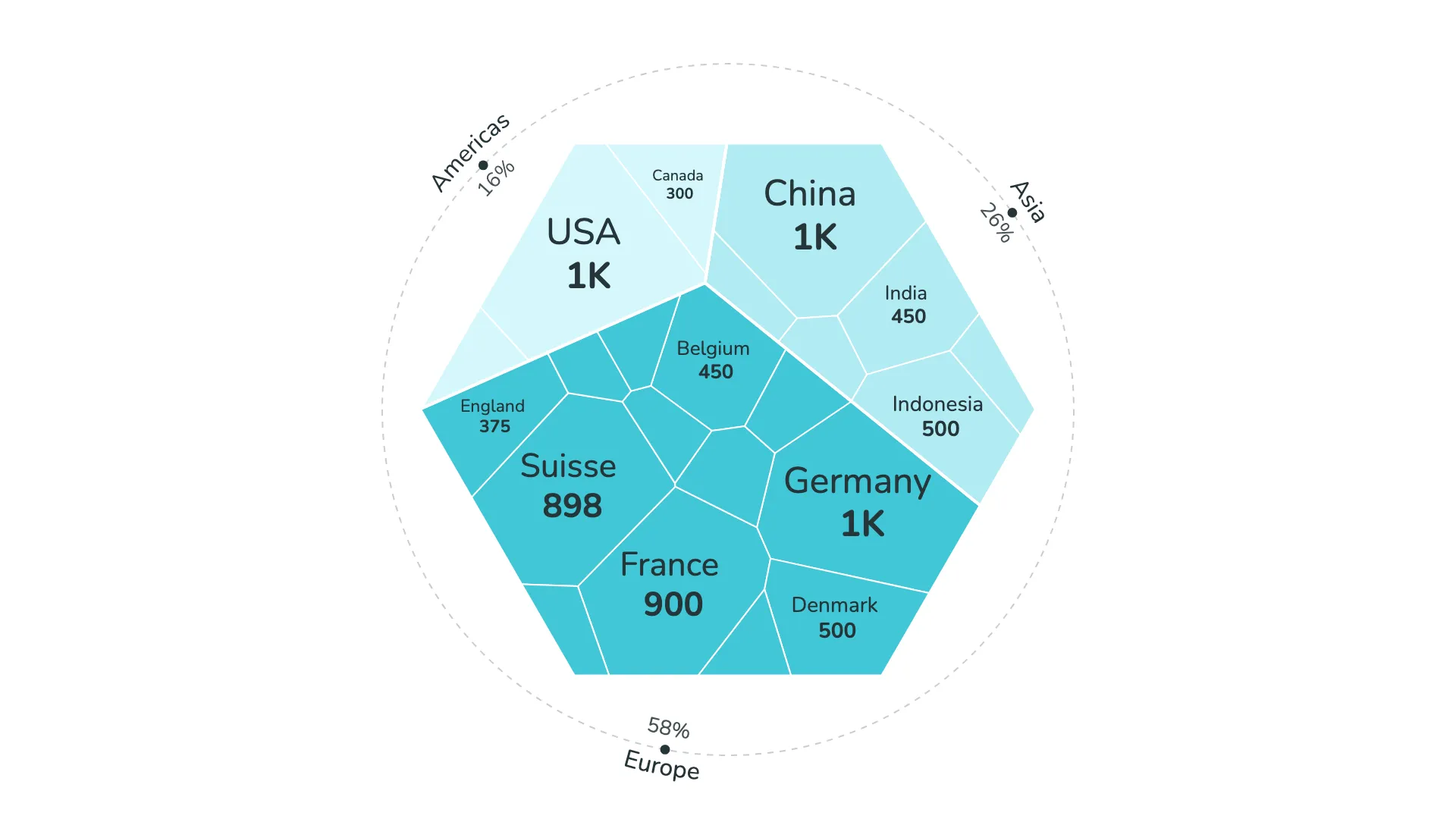
Working with two dimensions
When you use two dimensions, the polygon treemap creates a clear visual hierarchy. The first dimension controls the colors, grouping related items together visually. The second dimension determines how the space within each color group is divided into individual polygons.
This two-level structure helps readers understand both the high-level categories and the detailed breakdown within each category. The color grouping makes it easy to see which smaller segments belong together.
Circular legend for compact display
When working with two dimensions, the polygon treemap includes an option for a circular legend. This specialized legend is designed to work with the organic shapes of the treemap, showing the values of the first dimension in a compact format that complements the visual style.
The legend can display metrics as absolute numbers or as percentages, helping readers understand both the relative and actual values of each segment.
Smart label placement
Labels are automatically placed in the center of each polygon and scale based on the metric value they represent—larger values get larger labels. The visual calculates font sizes within your specified minimum and maximum values.
Overlap detection prevents labels from colliding with each other. You can control how many labels appear in total and set a threshold to hide labels on very small segments. This keeps the visualization clean and focused on the segments that matter most.
Color control with conditional formatting
The polygon treemap supports Power BI's conditional color formatting, allowing you to synchronize colors across multiple visuals using a DAX measure. You can also assign custom colors to individual dimension values, giving you complete control over the visual appearance.
This flexibility helps maintain consistent color schemes across your reports and ensures that specific categories always appear in their designated colors.
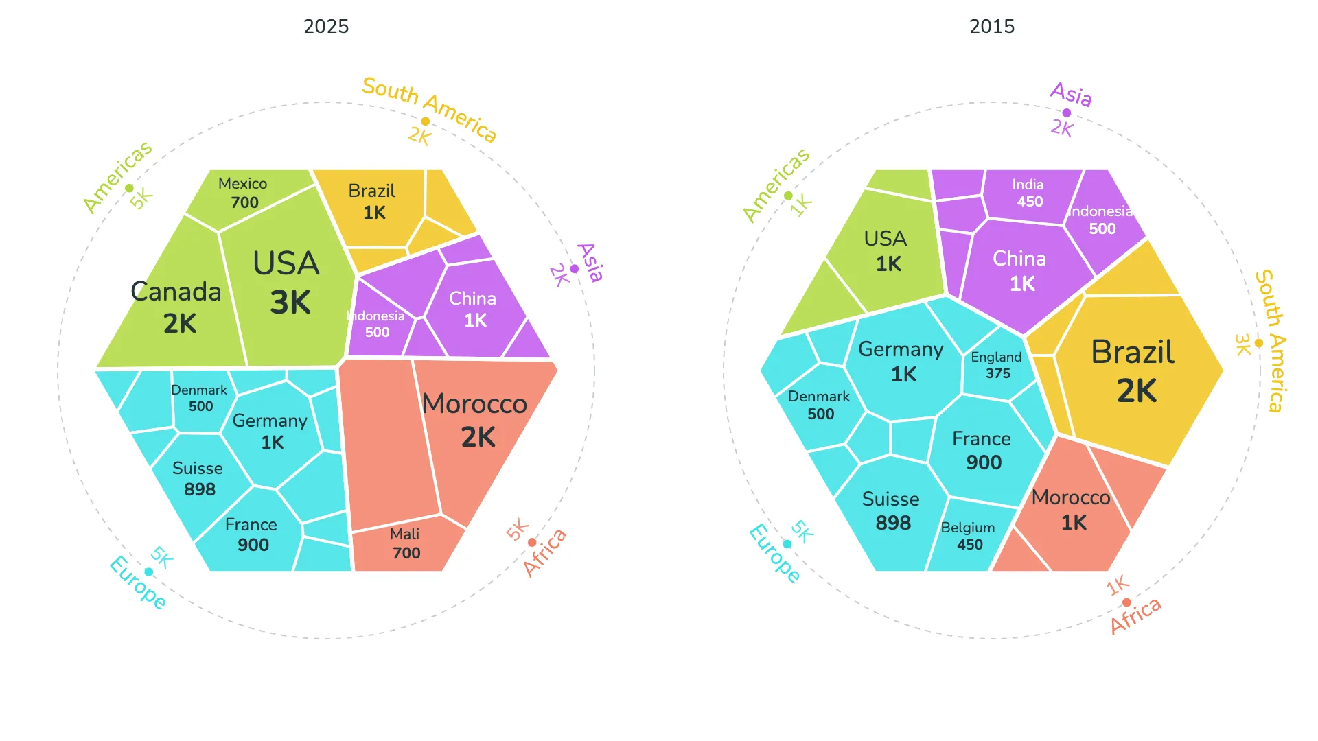
Small multiples add a third level
By using the small multiples feature, you can effectively create a third level in your hierarchy. Each treemap becomes one card in a grid, allowing you to compare the same data structure across different categories or time periods.
This approach works well when you want to show how proportions change across different contexts while maintaining the detailed breakdown within each context.
Dimension series and colors
As with other r42 visuals, the polygon treemap includes options to limit the number of displayed segments and group smaller items into an "Other" category. This helps ensure that individual segments are large enough to be meaningful and keeps the visualization readable.
The Dimension series and Colors sections in the format panel—which control segment limits, color schemes, and visual styling—are shared across all r42 visuals and are covered in separate articles.