This article gives an overview of the area design and the label placement features. Other sections in the format panel—such as Dimension series and Colors—are shared across all r42 visuals and are covered in separate articles.
Area charts
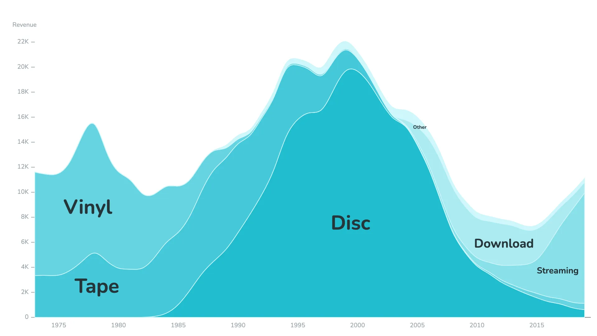
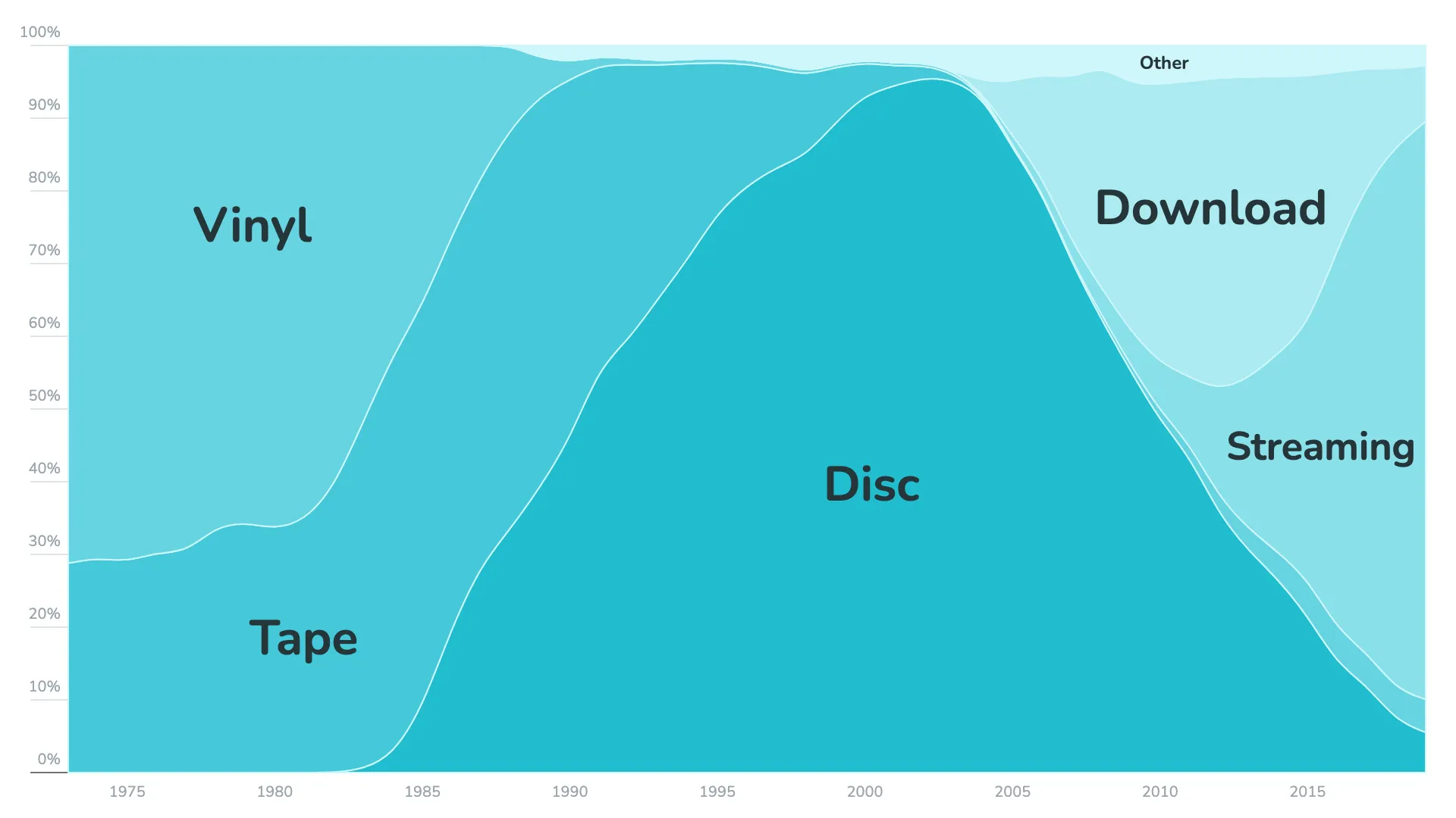
Stacked area charts are a familiar way to show how a total value is composed of multiple parts and how those parts evolve over time. A common variation is the 100% stacked area chart, where the y-axis always spans from 0 to 100%. Each colored area represents one component of the whole, and the components are stacked on top of each other.
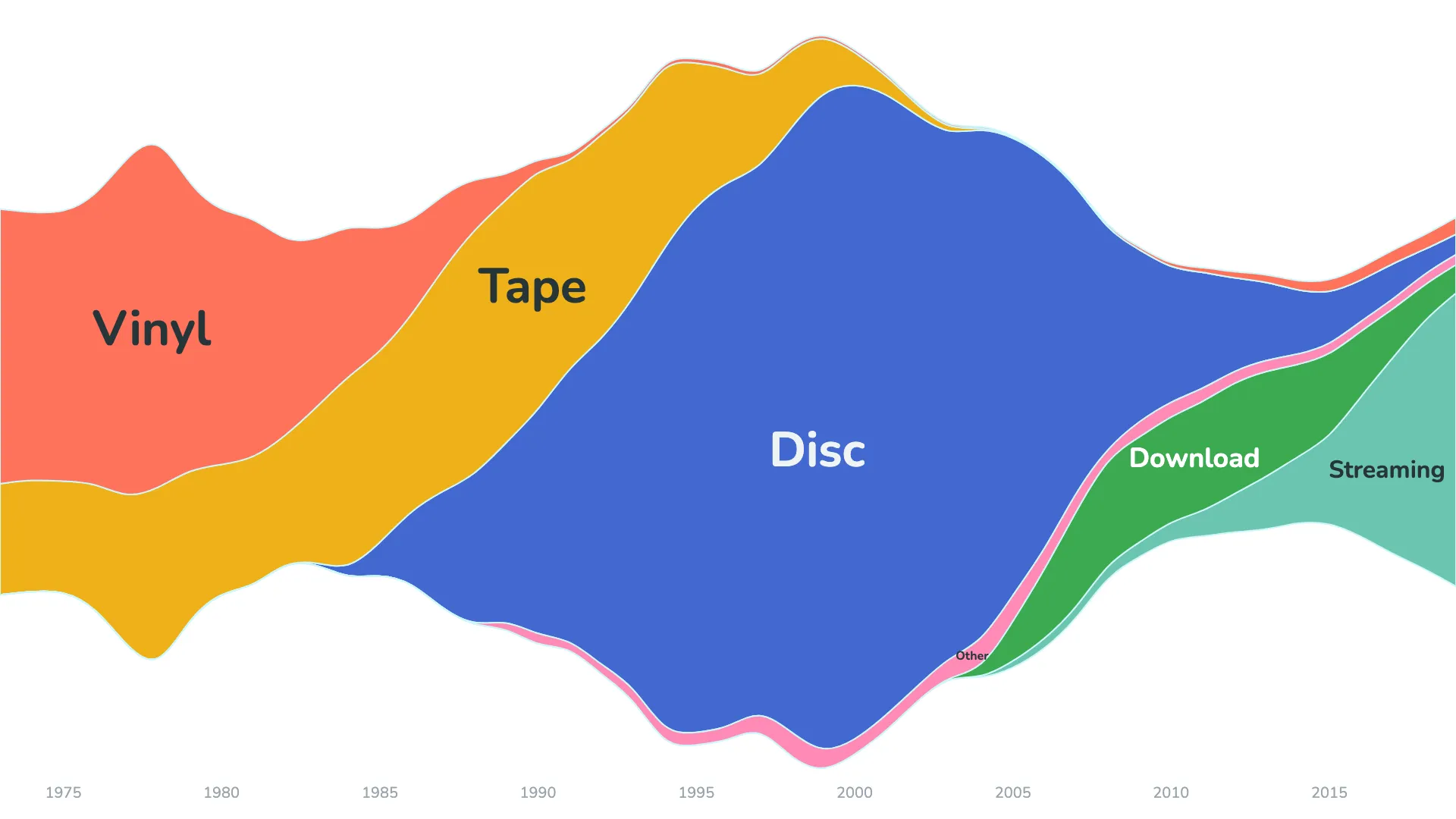
Streamgraph
Beyond the standard stack order, the visual includes two additional options that create more dynamic results: Centered and Wiggle. Both work best when used with the corresponding stack order.
- Wiggle generally produces the best result when combined with the inside-out order.
- Centered often works well when the time-appearance option is selected.
As always, results depend on the dataset, and it is useful to explore a few combinations.
What is the difference between Wiggle and Centered?
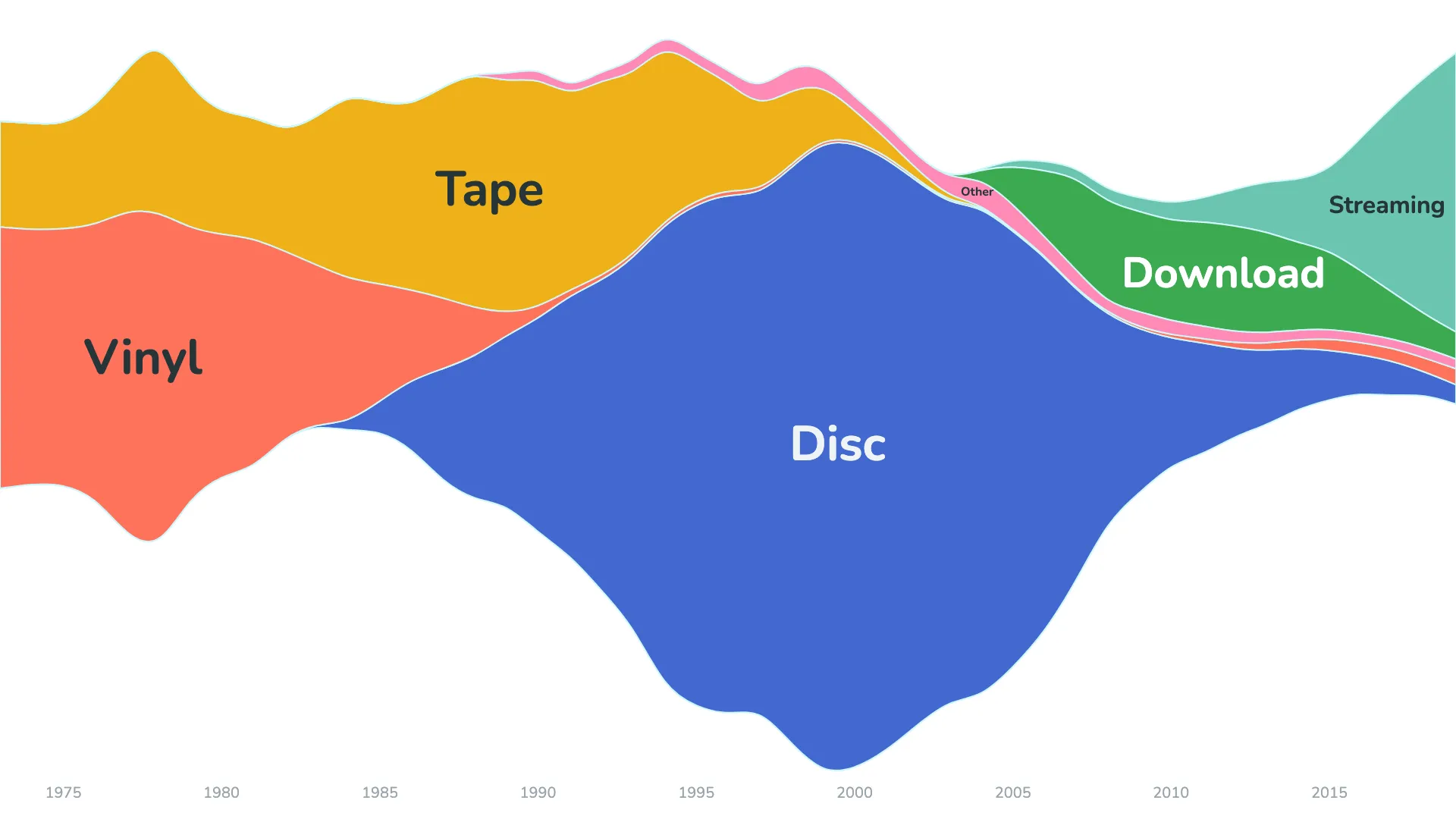
According to the Atlassian chart guide, a traditional stacked area chart places all values above a straight baseline at the bottom of the chart. A streamgraph, on the other hand, uses a baseline that runs through the center, with the areas arranged symmetrically around it.
The Wiggle method is closely related to Centered but shifts the baseline to minimize the "weighted wiggle" of the layers. This approach is recommended for streamgraphs when used together with the inside-out order, producing the characteristic flowing shape.
Label placement
In many stacked area charts, labels appear only in the legend, which can make it harder for readers to connect values with areas.
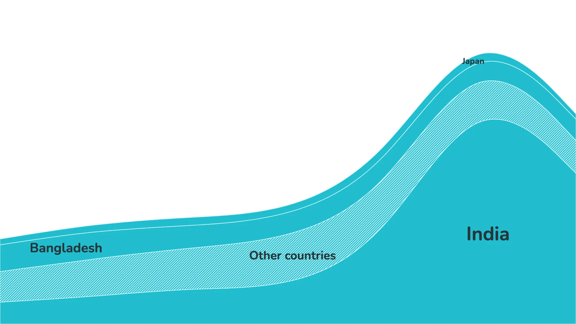
The r42 stacked area visual identifies a central point within each area and places the dimension label directly inside the chart. The font size adapts automatically within the minimum and maximum values set in the format panel.
The result is that the label size depends on available space rather than on the value itself. The format panel also includes options to avoid overlaps or to allow labels to extend beyond the area. Report authors can decide whether all labels should be shown or whether labels for very small areas can be omitted.
Dimension series
Most r42 visuals allow editors to limit the number of displayed series and group the remaining series into an "Other" category. This can help ensure that individual areas are large enough for labels to fit comfortably.
As with any visualization, each dataset behaves differently. A bit of fine-tuning usually leads to the best visual outcome.