In reports, opportunities are often missed to present simple metrics in ways that help readers truly understand what the numbers mean. The waffle chart is an easy-to-understand visualization where each small square or icon represents a fixed unit or percentage of the whole.
Waffle charts work well as visual alternatives to scorecards, more compact versions of donut charts, or clearer replacements for stacked bar charts. They can show a single metric, track progress towards a target, or break down a total into categories.
Using icons to count things
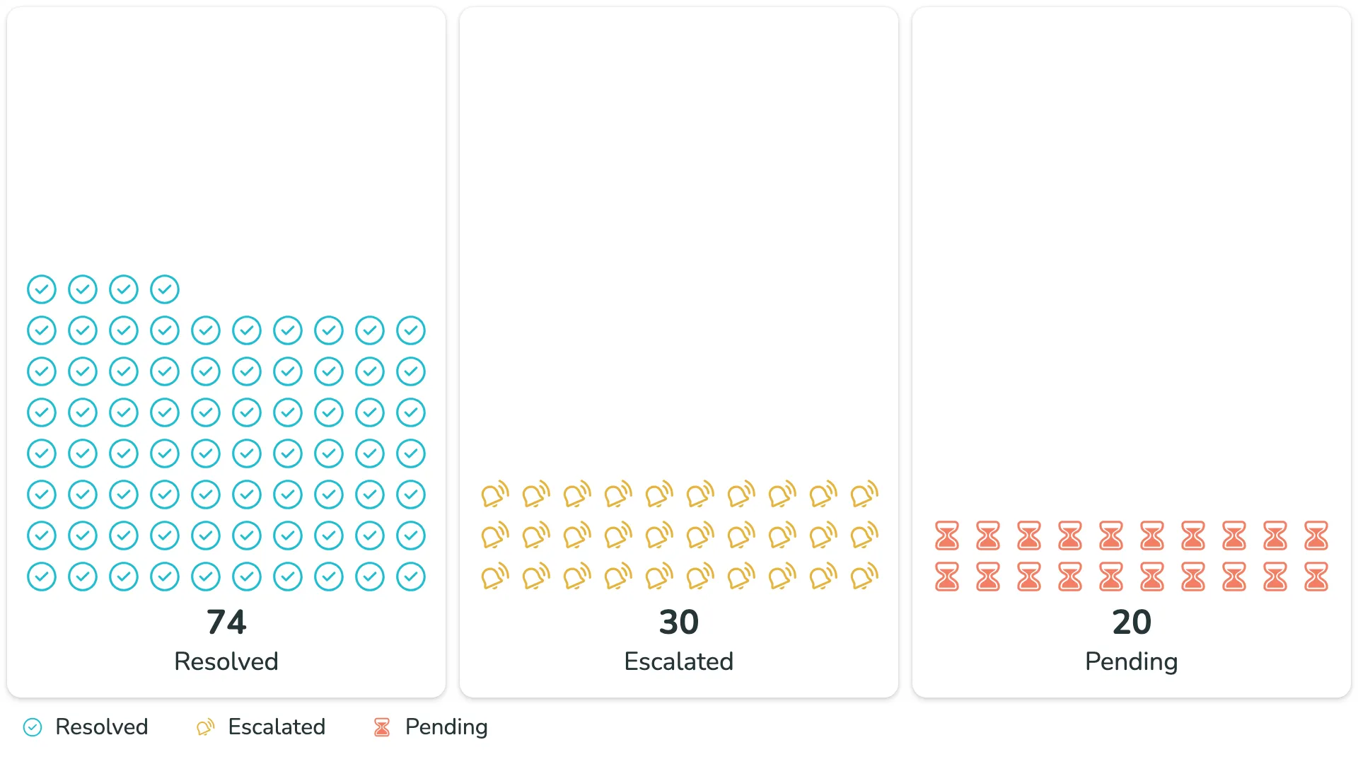
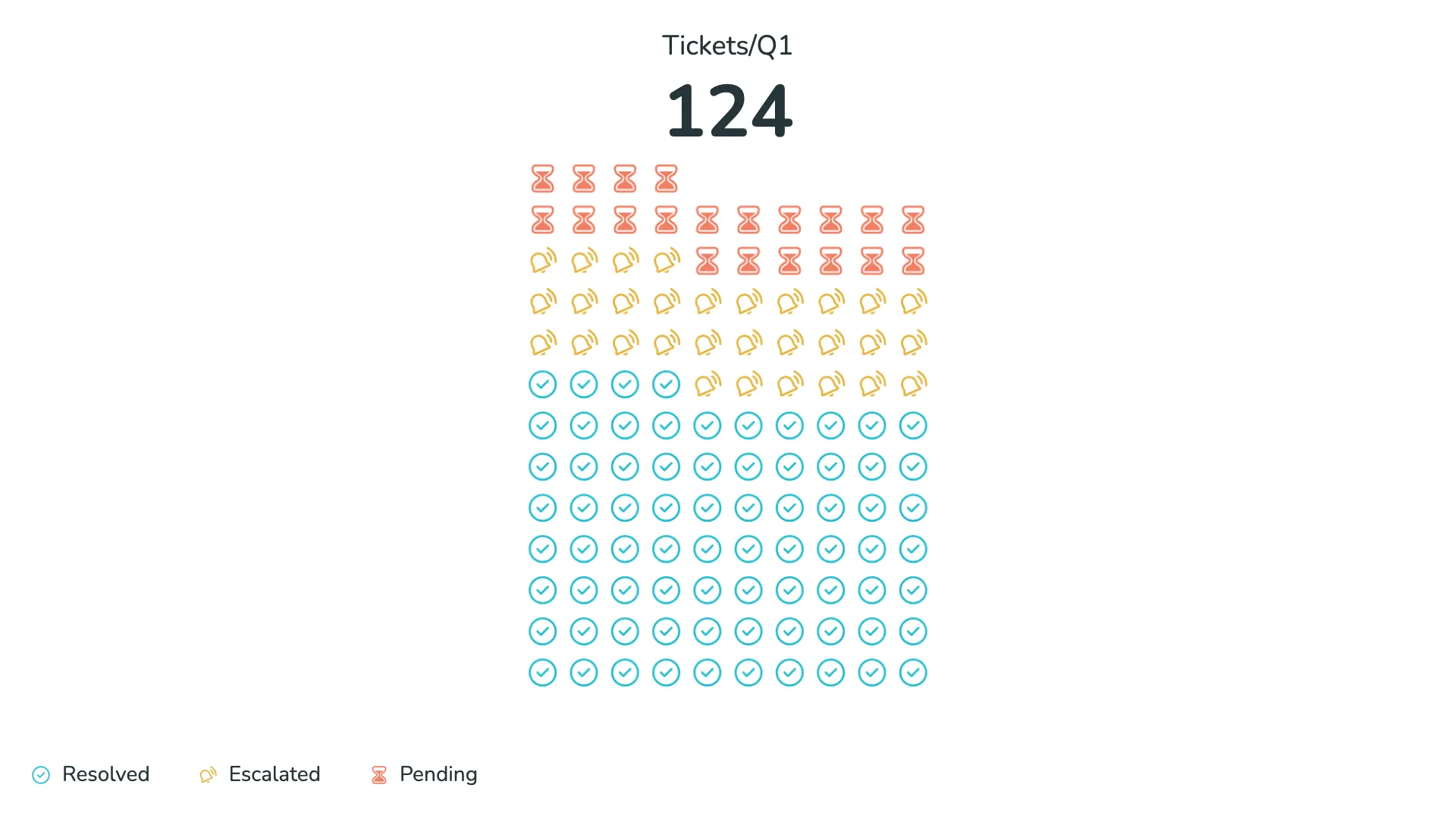
One of the most compelling features of the waffle chart is the ability to use custom icons instead of squares. Each icon can represent one or more items, making it easy to visualize "how many" of something you have.
For example, when tracking support tickets, you can use different icons to represent resolved, escalating, and pending tickets. Each icon makes the status immediately recognizable, and the count becomes visual at a glance. The visual communicates both quantity and status in a way that numbers alone cannot.
Icons can be arranged in multiple waffles to compare different categories, or stacked within a single waffle to show composition. In many cases, icon-based waffles create a clearer picture of proportions than traditional donut or pie charts.
Tracking progress towards targets
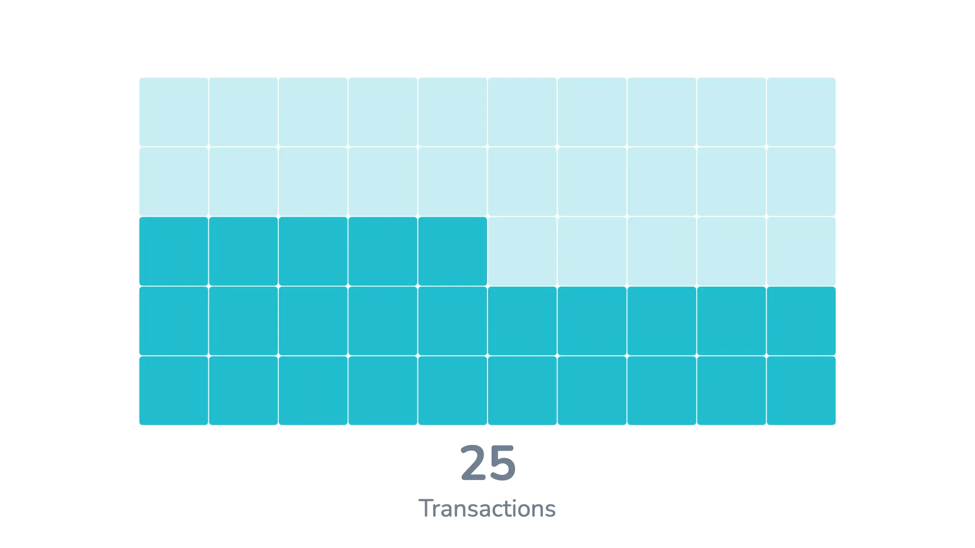
Waffle charts are particularly effective for showing progress. You can add a second metric to represent a target, and the visual will display the relationship between your actual value and your goal.
Target values appear as a semi-transparent overlay, making it immediately clear how close you are to reaching your objective. When you have multiple waffles showing different metrics or categories, each can have its own target value, allowing for side-by-side comparison of progress across different areas.
Highlighting over-target performance
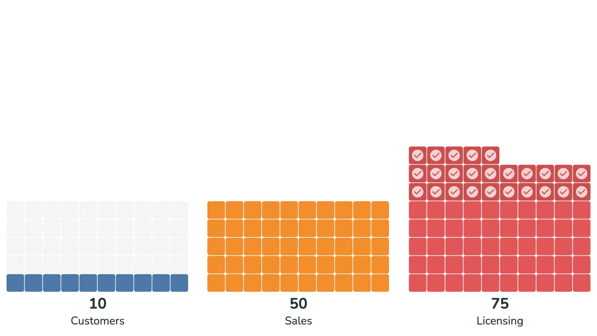
When a metric exceeds its target, the visual can automatically highlight this achievement. Units that go beyond the target can be shown in a different shade or with an overlay icon, making over-performance immediately visible.
This feature is useful in dashboards where you want to celebrate wins or draw attention to areas that are performing exceptionally well.
Comparing completion rates
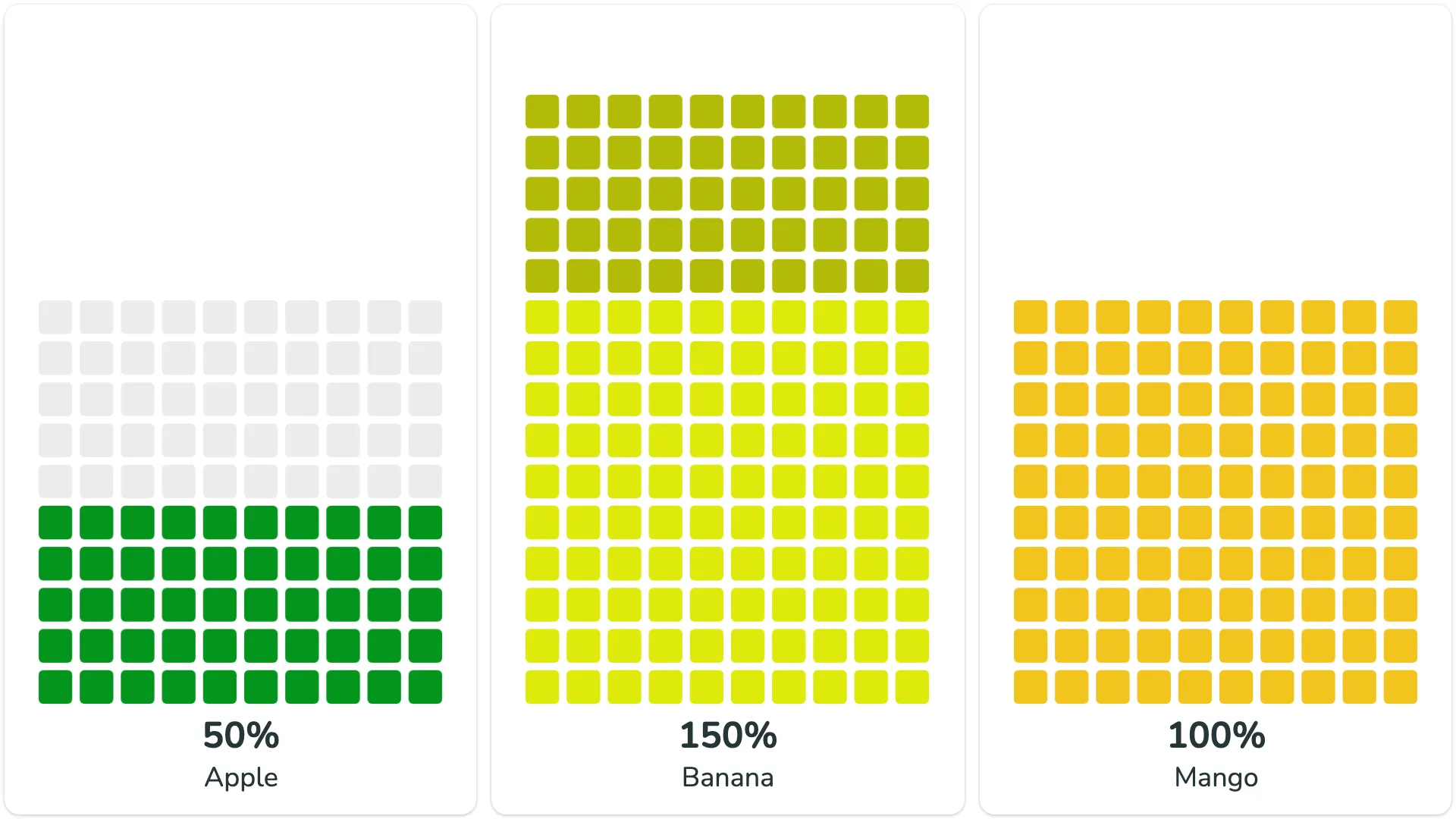
When you need to compare how different categories or metrics are progressing, normalizing all values to percentages can make comparison easier. The waffle visual can display all metrics as completion rates, showing each one on a scale from 0% to 100%.
This normalized view is particularly useful when the absolute values vary widely between categories, but you want to understand relative progress across all of them.
Flexible layout options
The waffle visual gives you control over how the grid is arranged. You can adjust how much each unit represents, how many units appear in each row, and how much spacing sits between them.
These options let you create layouts that fit your dashboard design—whether you need a single tall column, a wide horizontal grid, or something in between. You can also control where the waffle sits within its container, choosing top, middle, or bottom alignment.
For example, if you're showing population data where each square represents one million people, you might use a narrow layout with just a few units per row. If you're showing percentage completion, you might arrange the units in a 10×10 grid where each unit represents 1%.
Breaking down by category
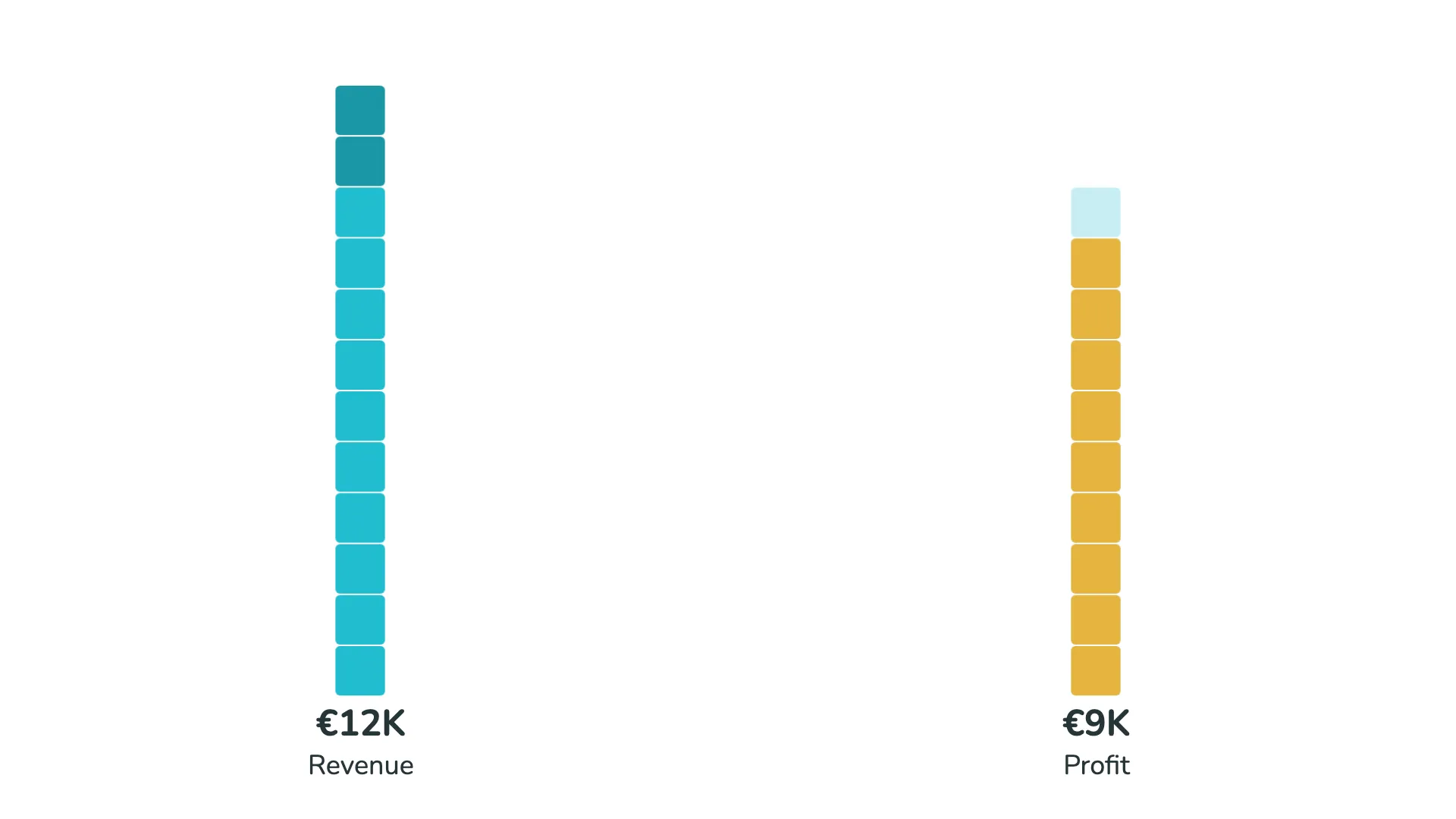
Beyond showing simple progress or counts, waffle charts can display how a whole is divided into parts. Each category gets its own color within the grid, similar to how a stacked bar chart works, but often with a clearer visual result.
This stacked approach works well when you want to show composition while maintaining the intuitive grid format. It's particularly effective when you have a few clear categories that make up a total.
Dimension series and colors
As with other r42 visuals, the waffle chart includes options to limit the number of displayed categories and group smaller segments into an "Other" category. This helps ensure that your waffle remains readable and that individual segments are large enough to be meaningful.
The Dimension series and Colors sections in the format panel—which control category limits, color schemes, and visual styling—are shared across all r42 visuals and are covered in separate articles.