The city of Montreal has installed bike counters across the island to monitor cycling activity. r42 used this open data to find patterns in the traffic.
Which counters see the most cyclists? When do people ride? What trends emerge over the years?
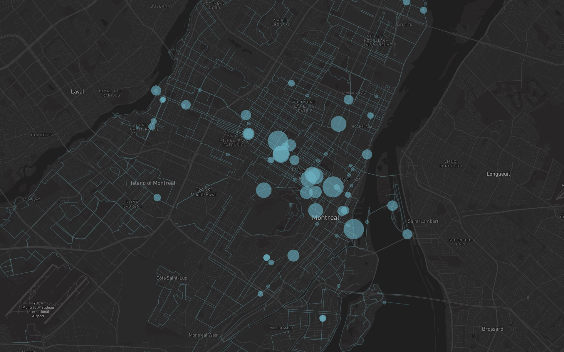
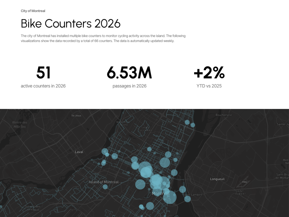
The first visual is a map of the counter locations. Most traffic runs on the north-south axis connecting downtown Montreal with high-density neighborhoods like the Plateau and Rosemont.
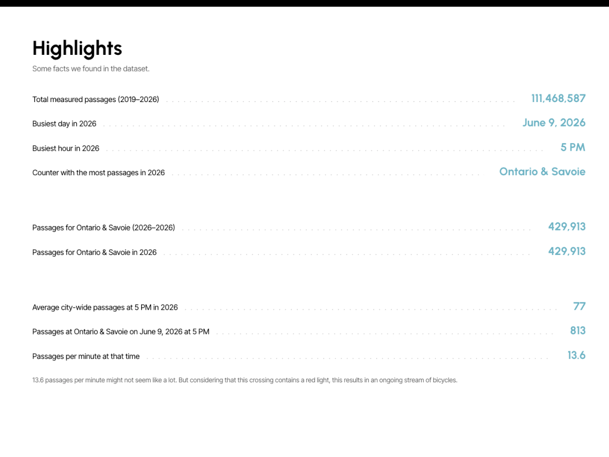
A list of highlights gives the overall story and puts the numbers in context. More than 100 million passages were measured over about seven years. Some counters see almost 1,000 bikes in a single hour.
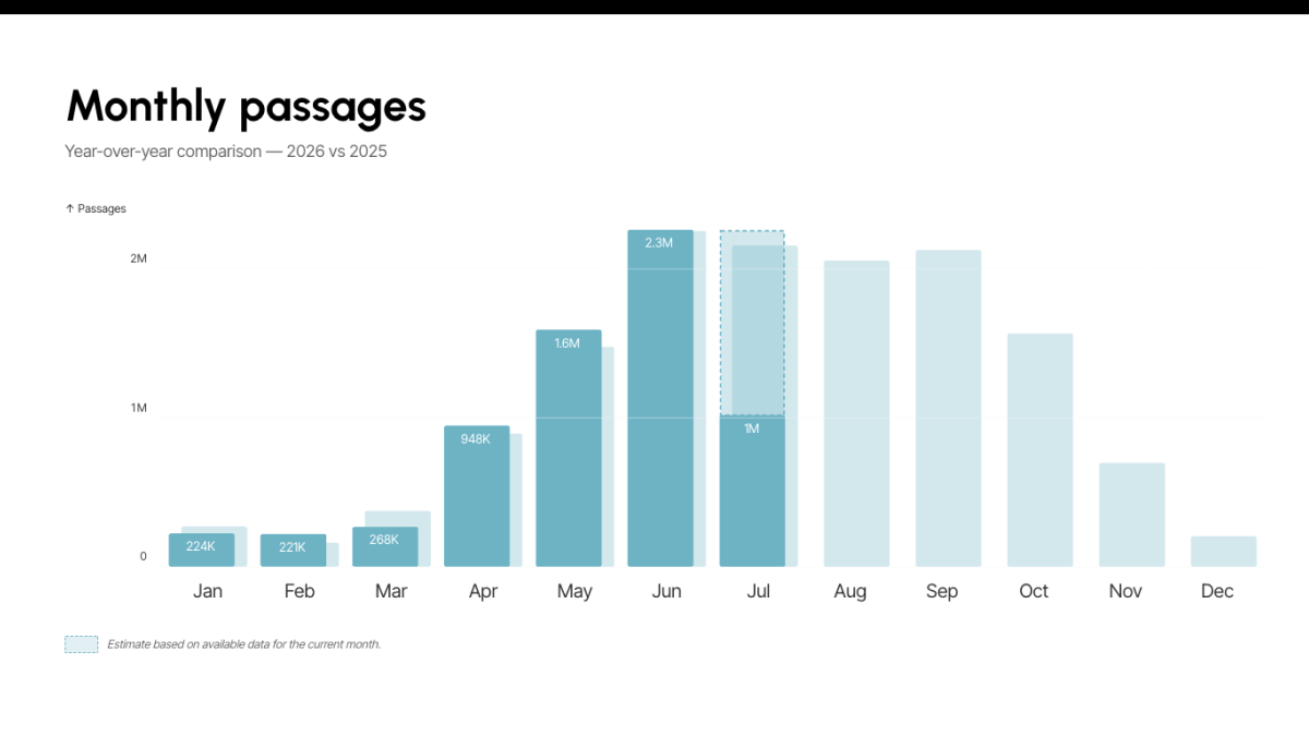
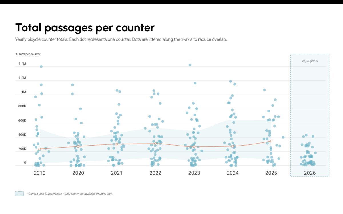
Other visuals compare current and previous years or rank counters by monthly passages to show how much they differ.
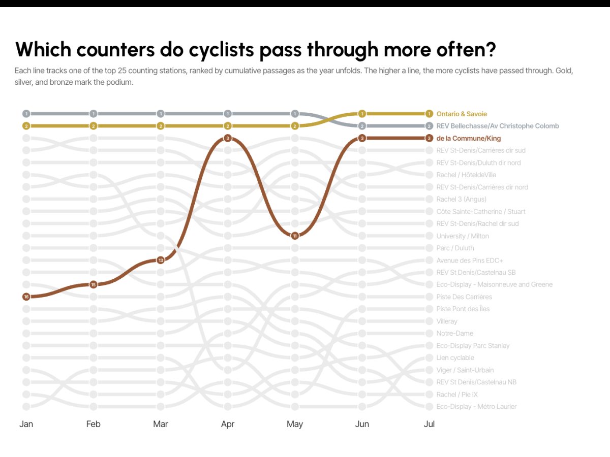
Which counters see the most traffic throughout the year? A bump chart answers that clearly. It also shows how rankings shift during the year. Some changes have obvious reasons, like the holiday season. Others might be broken counters. We will never know for sure.
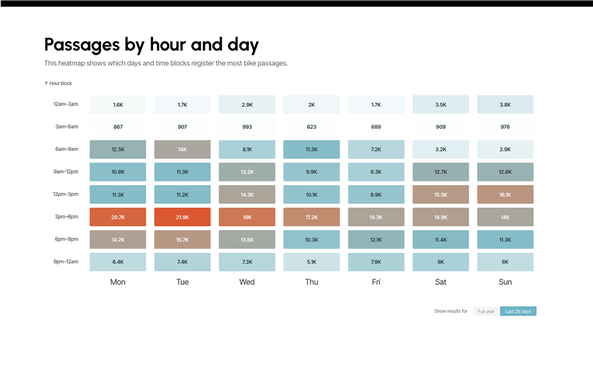
Heatmap matrices show the busiest hours and days of the week. On average, Tuesday afternoons see the highest concentration of cyclists.
The data refreshes daily. Check back to see if the counter near you is getting more traffic.