Case study

World Cup 2026

A World Cup produces plenty of data. We started with a simple list: the participating players. Where do they play during the season? That question became the core of a small data story.

The result is a micro-website with five views of one list.

Visit it at world-cup-26.r42.ca

World Cup 2026 match schedule overview

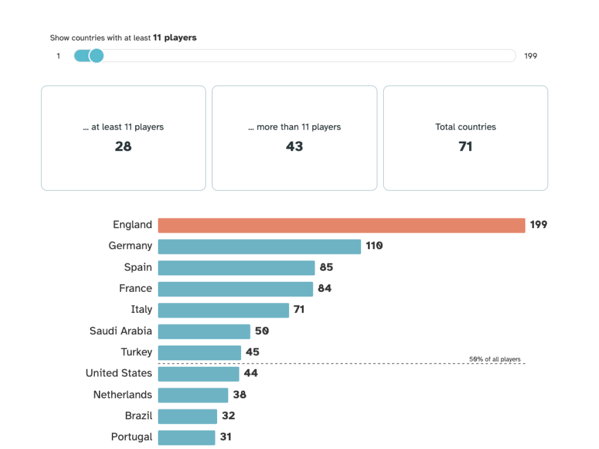
The first two visuals rank the countries where participants play during the season. The league with the most money sits at the top, which is no surprise. More surprising: half of all participants play in just seven countries.

Stadium capacity and attendance across host cities

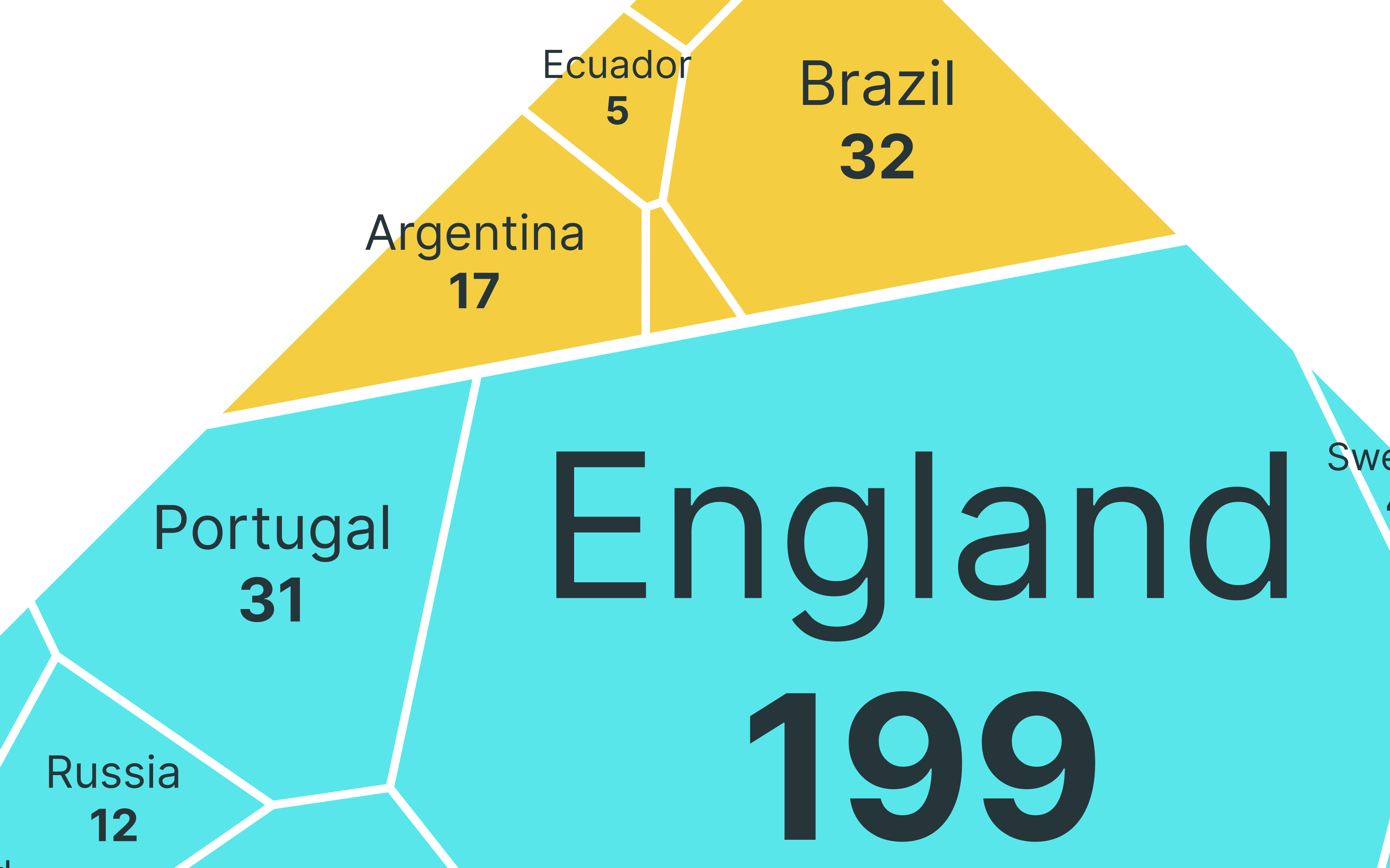
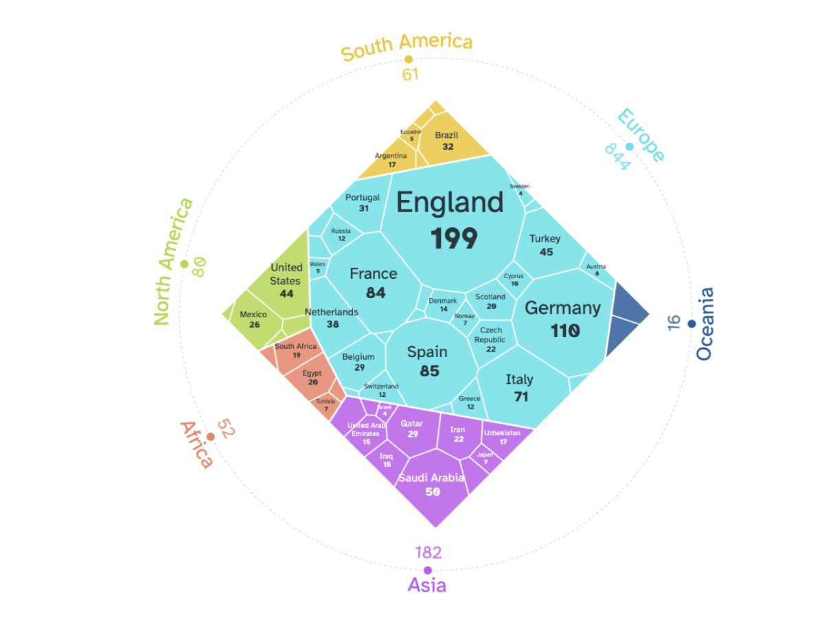
A treemap adds a second hierarchy: continent. Most players earn their money in Europe.

Travel and logistics between host venues

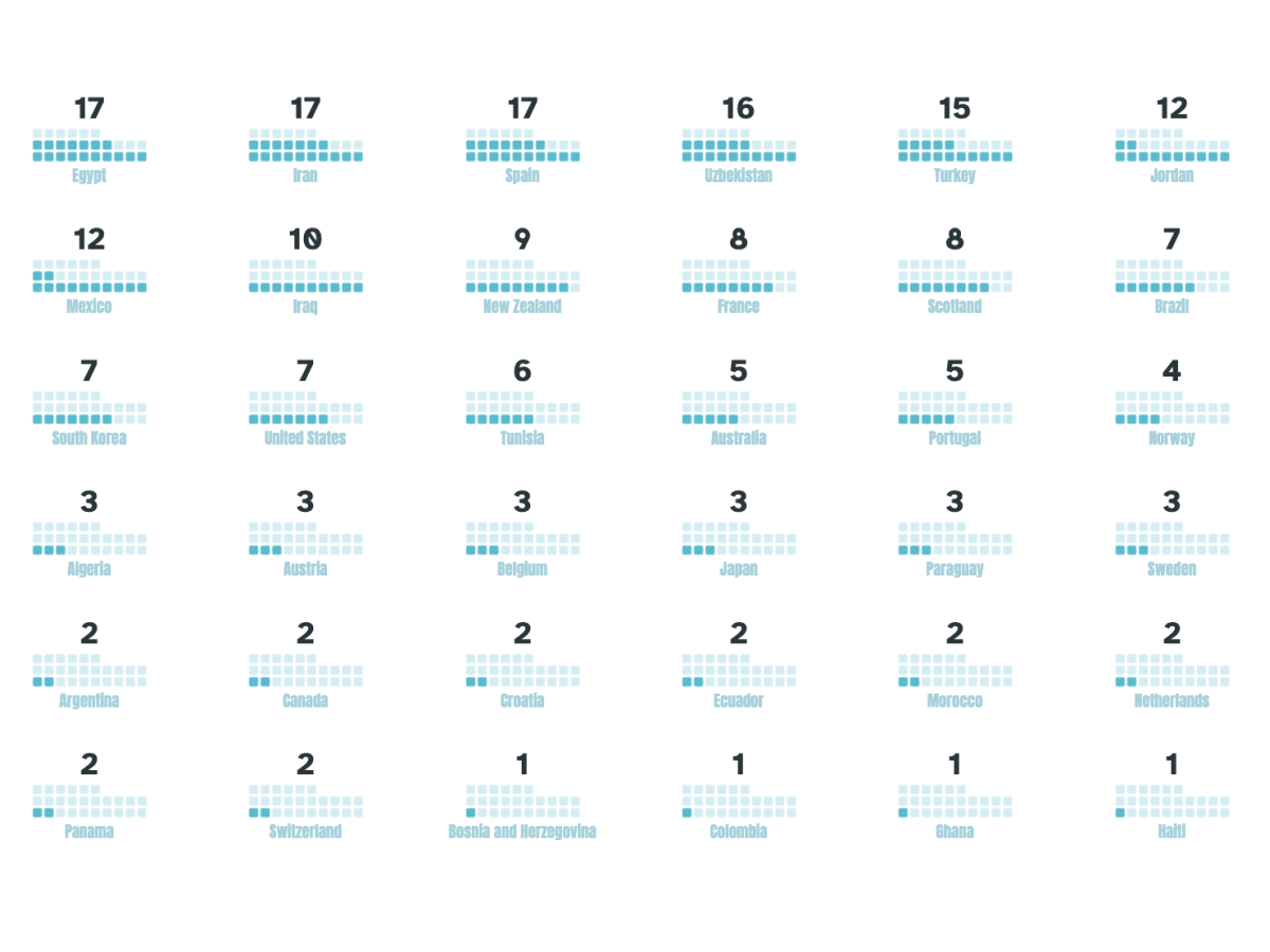
A waffle chart shows how many players play in the same country as their national team.

Social media and fan engagement metrics

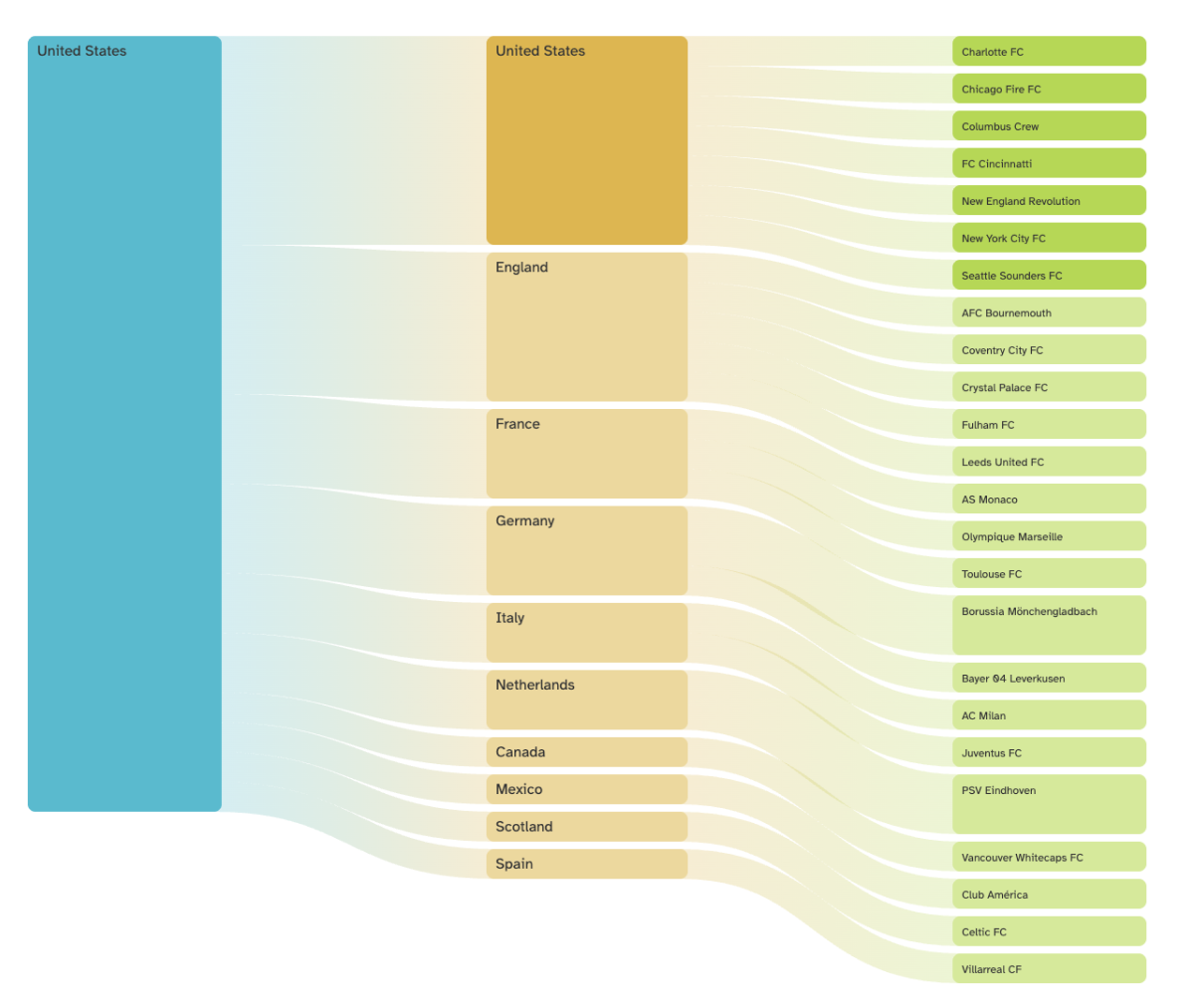
The last visual is available for each country and shows exactly which clubs its players belong to during the season.

More case studies

Need to keep a complex event under control?

From tournament logistics to city operations, we can help you build a dashboard that keeps every stakeholder on the same page.

Let's talk