Likert Survey
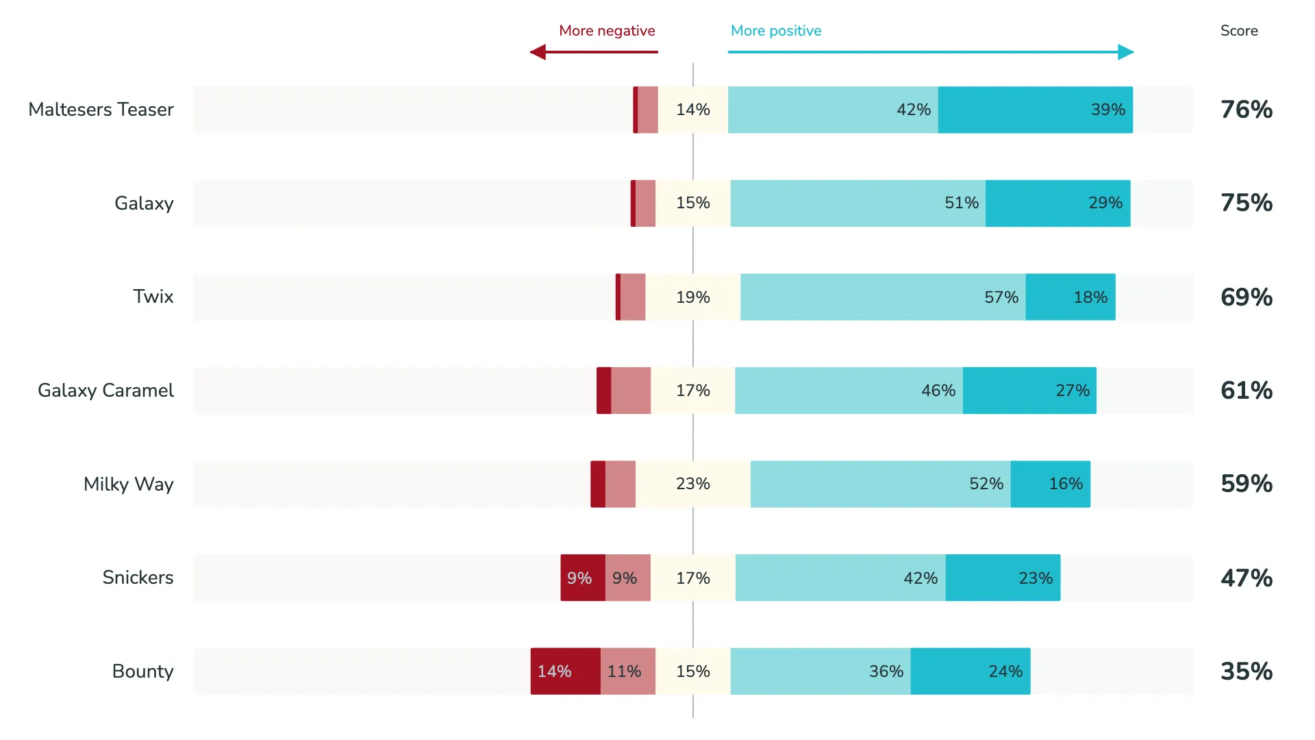
The Likert Chart is designed for survey and feedback analysis where responses span from negative to positive sentiment. It helps you compare questions quickly with centered Likert layouts, normalized views, and ranking options that make patterns easy to spot.
Switch between normalized and absolute Likert views depending on whether you want to compare proportions or raw response counts. Combine sentiment-aware color control, overall rating metrics, polarity labels, sortable questions, and refined bar styling to build a survey visual that is both analytical and presentation-ready.
Gallery
Quickly visualize sentiments from Likert scale data.
Marketplace
Visit the Microsoft Marketplace to download this Power BI custom visual
and discover related reporting examples and report themes.
KEY FEATURES
 Multiple Likert view modes
- Configurable bar presentation
- Relative or absolute data labels
- Custom polarity annotations
- Customizable legend
- Built-in summary scoring
- Flexible ranking sort
- Central sentiment divider
- Fully customizable metric axis
- Series management
- Comprehensive color management
- Interaction effects
- Small multiples
- Easy card styling