Waffle
The Waffle chart transforms your data into a grid of icons, making it easy to see progress and how a few parts add up to a whole.
It's a visually appealing alternative to pie charts and progress bars, letting you design waffle charts that can fit neatly into your dashboard layout: control the grid layout, fine-tune how each square represents your data, and add targets with automatic over-performance highlights. Customize category and value labels so they stay legible and on-brand, whether you're showing a single KPI or a small breakdown of a whole.
Gallery
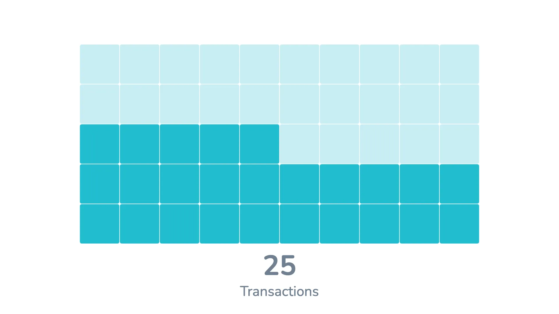
Each item is represented as a unit and placed against a target.
Marketplace
Visit the Microsoft Marketplace to download this Power BI custom visual
and discover related reporting examples and report themes.
KEY FEATURES
 Flexible layout options
- Precise control over unit scaling and spacing
- Built-in target comparison
- Automatic highlighting of over-performance
- Fully customizable category labels
- Data labels with flexible positioning
- Layout control for small multiples
- Easy card styling
- Global formatting control
- Native tooltips
- Comprehensive color management
- Advanced series management
- Opacity-based interaction effects
- Customizable legend